Introduction
Today we will be making maps that can be published on the internet.
The process of publishing the map is fairly straightforward, however, the cartographic principles we use are a little bit different. Up to this point, we have had a great deal of control over how our maps are viewed: we have been able to choose the paper size, set the scale, and carefully adjust the position of the elements to avoid overlap. However, as we enter the world of web mapping, we no longer get to know what screen size the user will have. The user gets to choose the zoom level and position. It then becomes our job as cartographers to use the tools we have to make the display as robust as possible to clearly communicate with users regardless of how they view our web map.
For today’s lab, we will first be recreating the NTS web map that we looked at all the way back in the second lab:
https://arc.gis.unbc.ca/portal/apps/mapviewer/index.html?webmap=bc5abed9cd044294882703e918c6419a#
After that, we’ll look at another approach to mapping the ICBC Crash data.
Our first web map
Start by creating a new project in ArcGIS Pro for your ‘NTS Map’ inside of your GEOG205 folder. In the top-right corner of your screen, make sure that you are signed in to the https://unbc.maps.arcgis.com/ portal. Is that the link that is displayed? If not, follow the instructions under ‘Changing Active Portals’ here: https://gis.unbc.ca/support/arcgis-pro-portals/
The process for making a web map starts out exactly the same as a paper map. Where we will see differences is in the styling as we will not have exact control of what zoom or extent the end user will see; this will require making design choices that will be robust to different positions. This may mean making some compromises on the overall styling to ensure a consistent user experience.
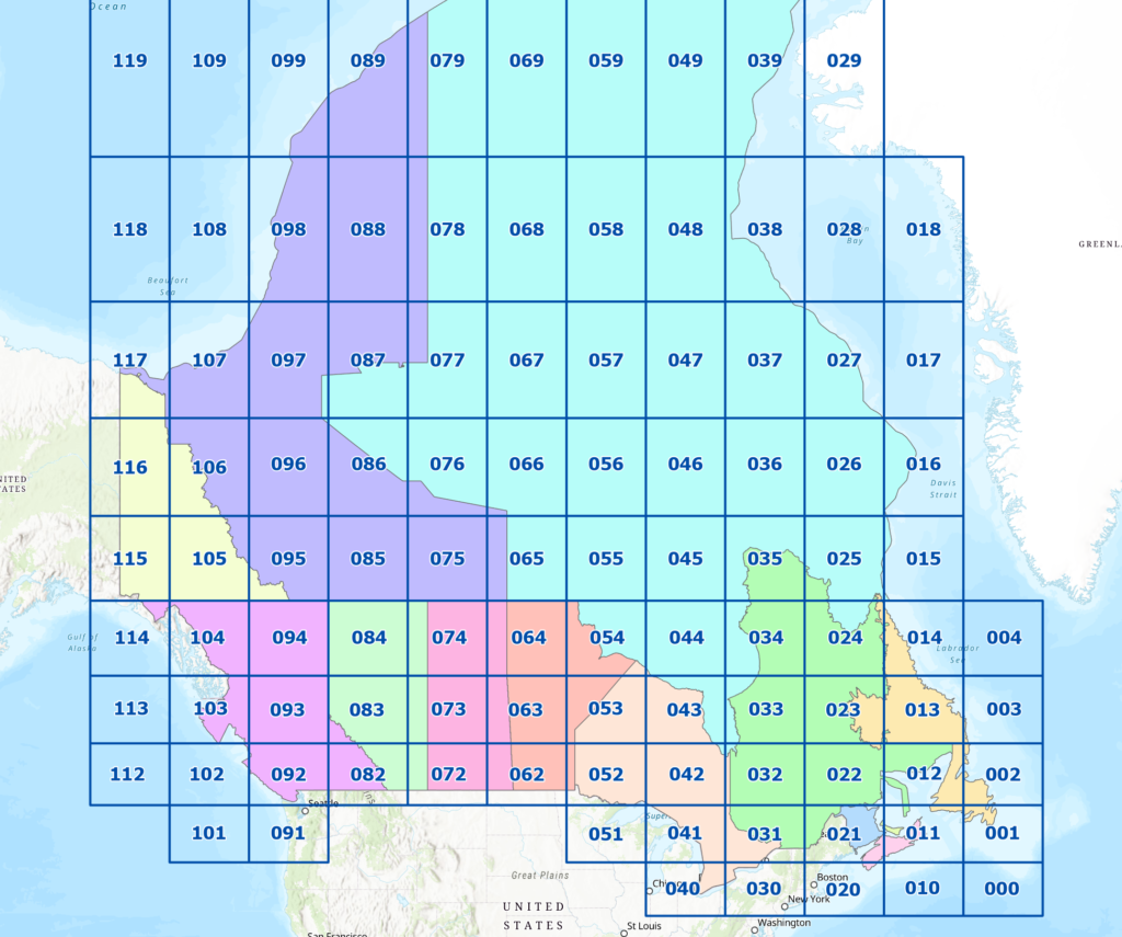
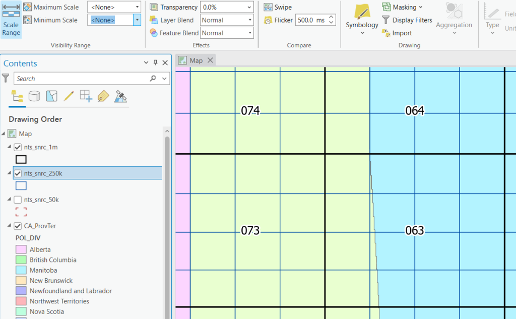
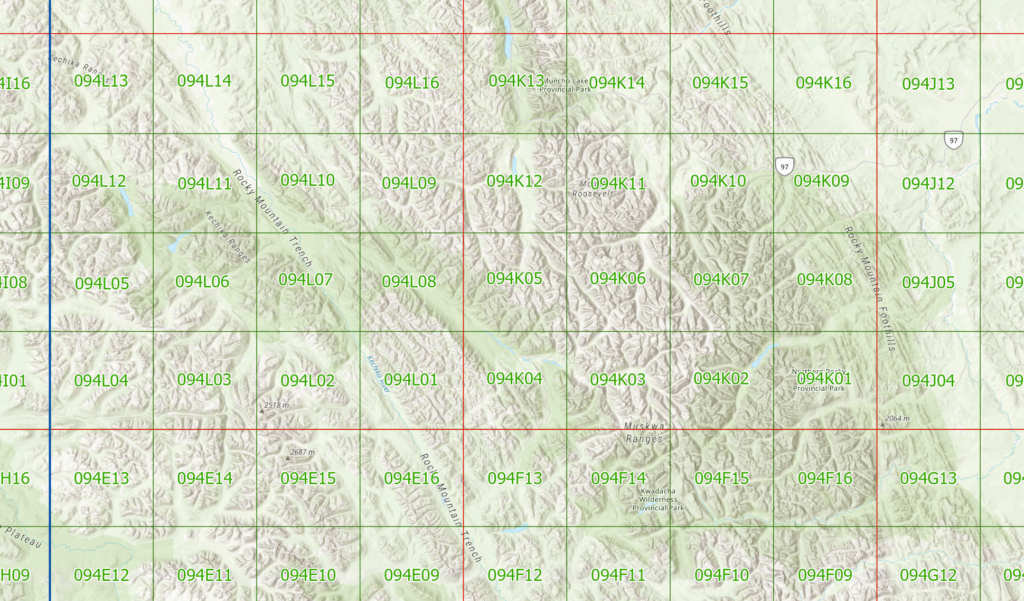
Inside L:\GEOG205\lab07\nts_snrc you will find layers nts_snrc_50k, nts_snrc_250k, nts_snrc_1m, and CA_ProvTer. Add all 4 layers to your map. You should have something as below:
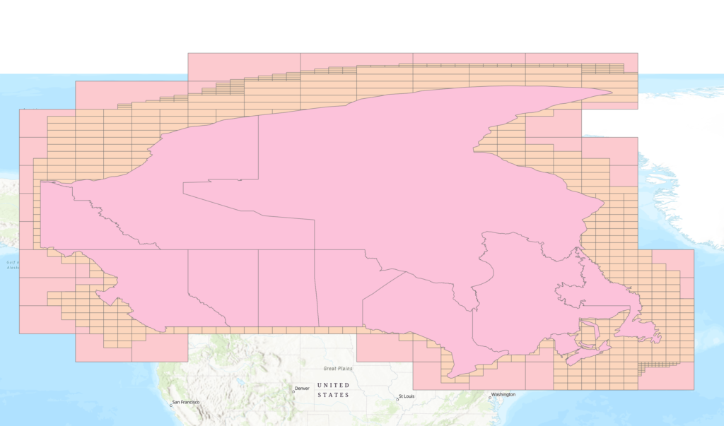
Rearrange the layers as follows
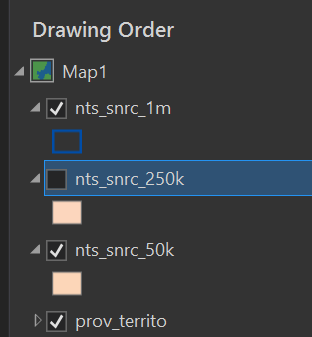
Because this will be a web map, we want to change the projection to Web Mercator (EPSG 3857), this can be done by right-clicking on the ‘Map’ in the Drawing order, going into Properties, then Coordinate Systems and searching for ‘web’ or ‘3857’.
If you were publishing a 3D scene you would want unprojected data EPSG 4326.
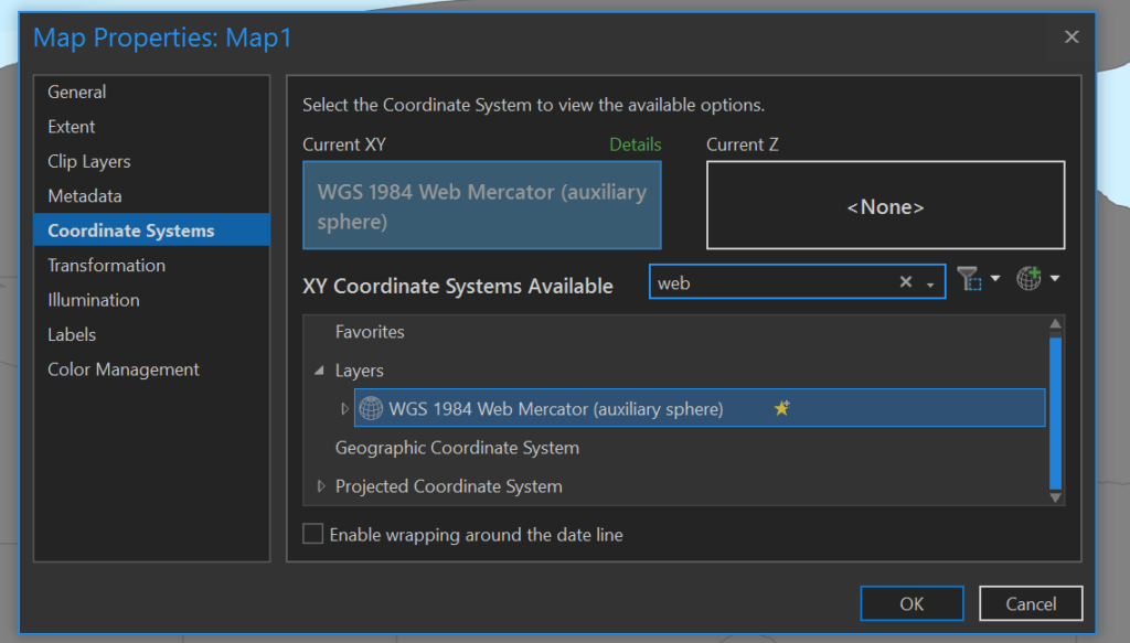
Next, we will start working through this one layer at a time, turn off all layers except CA_ProvTer. We will style this with the Unique Values symbology, using POL_DIV as the Field. Click ‘add all values’ in the Symbology pane if they don’t turn up in the list on their own.
When we start adding the map tile layers, we will style and add labels. This will start to look cluttered, but at this stage trust the process as we will be returning to change how the layers interact with each other after they are all added.
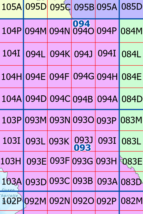
Add the 1:1 000 000 map grid (nts_snrc_1m).
- Make the styling a hollow outline, the colour can be whatever you wish
- Add labels using the ‘IDENTIF’ field
- Text should be 16pt with a halo
- Placement should be set to ‘Land Parcel’
At this stage you should have a functional index of the 1:1M map sheets.
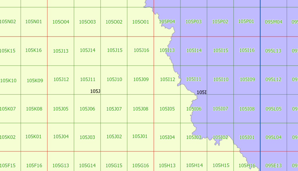
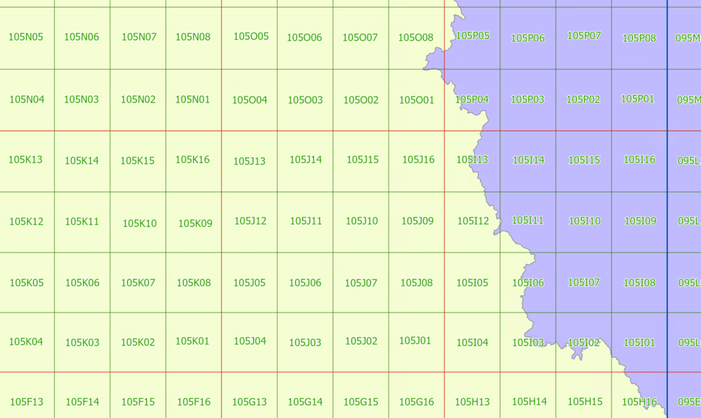
Next, we will add the 250k layer; use a similar pattern for styling, this time using the NTS_SNRC field for label text.
You may wish to use a different colour for clarity; as well as making the lines thinner to denote that it is, in comparison, a minor division.
Scale and Web maps
Map scale works differently on the web. Generally speaking, we refer to zoom levels as opposed to scale when making web maps; in part, because we do not know how big the end-users screen will be compared to its resolution. Practically, this means that we will see some strange scales that are not round numbers, which is the software going to its natural zoom levels. There’s no need to worry about these awkward scale values like we do with printed maps.
You can see this when looking at a google maps URL such as https://www.google.com/maps/@53.989288,-122.6068734,10.9z. The end of this URL has a z-value: this is the zoom. Historically, the z value was always a whole number between 1 (entire earth) to 20 (maximum zoom), however these days due to the variety of screen resolutions and a desire for intermediate zoom levels, the z is generally a decimal number.
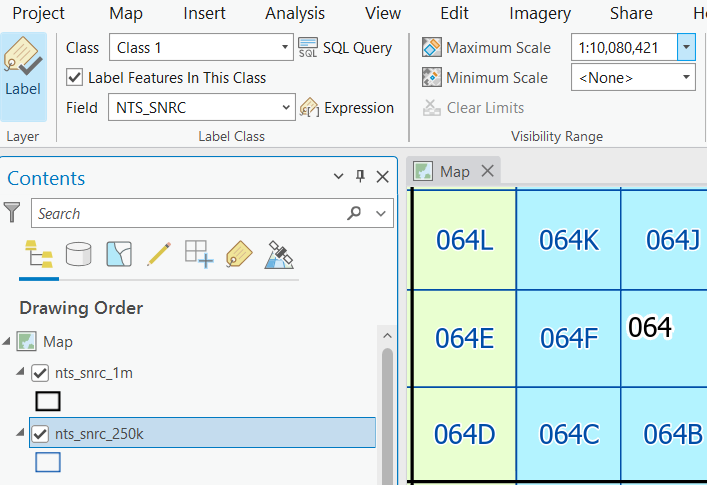
Back to our ArcGIS projects, as the multiple scales are now cluttering the map, the next step will be to use scale-based visibility to turn the layers on and off at different zoom levels.
The goal at this stage is that as the map is zoomed in, the line work for more coarse layers should remain, however the labels should be hidden when the next layer appears.
Start by zooming to a point where the labels for the 250k map sheets fill most of the tile. We want the labels to be clearly visible, but still contained within their boundaries.
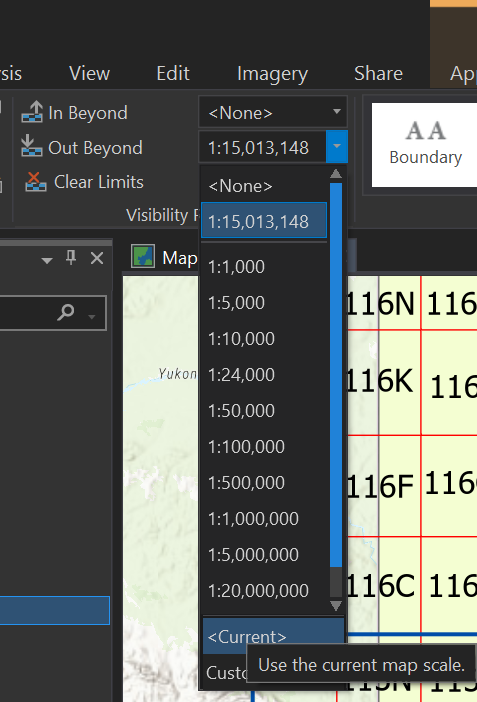
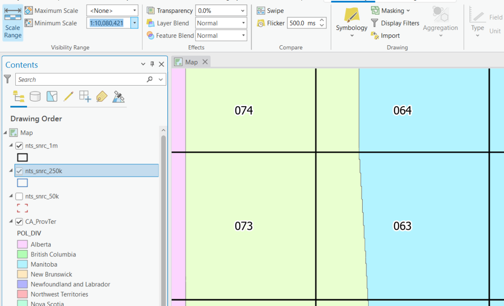
We will now set the Maximum scale labeling property of the 1:1M layer to <current>. What this means is the labels will be turned off if the scale is more coarse than the current view. Copy the scale value from your 1:1M layer, and we’re going to paste that into the Minimum Scale for the 1:250k layer. It doesn’t matter what exact scale you choose–what does matter is that you are using the same scales to turn off one layer, and turn another one on to avoid glitches where they are both present or both missing.
Now, select nts_snrc_250k, go to the Feature Layer Tab, and set the Minimum Scale here to the same value (You will see it in your history directly below <None>. This will cause the line-work to be turned off when we zoom out.
Turning this:
into this:
We will stop here and make sure that everyone is caught up to this point.
Finally, we will add the 50k tiles in a similar style as before using a hollow symbol, and set the labels to the NTS_SNRC field, with 16pt font with a halo. Next, zoom so that the labels fit comfortably inside, just like we did for the 1:250k layer.
Set the 50k layer for both appearance and label Minimum Scale to this <current> Zoom. Set the 250k labeling Maximum Scale to the current Zoom.
One more thing we can do to make the map more usable is to set the CA_ProvTer layer Maximum Scale to the same scale we used to activate the 250k layer–this will allow us to see the map below the polygons.
Zoom in or out to the extent you would like to be the ‘home view’ of your web map that viewers will first see when they access your map.
Publishing our map
Publishing the map is very easy once the layers are set up with the correct styling. This is also a good time to rename your layers in the drawing order before uploading; this will be easier to change now than after publishing.
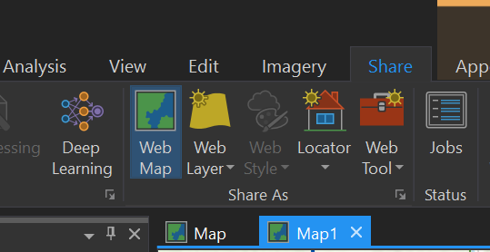
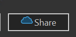
Sign in to UNBC ArcGIS Portal if needed, then go to the Share tab, and press Web Map.
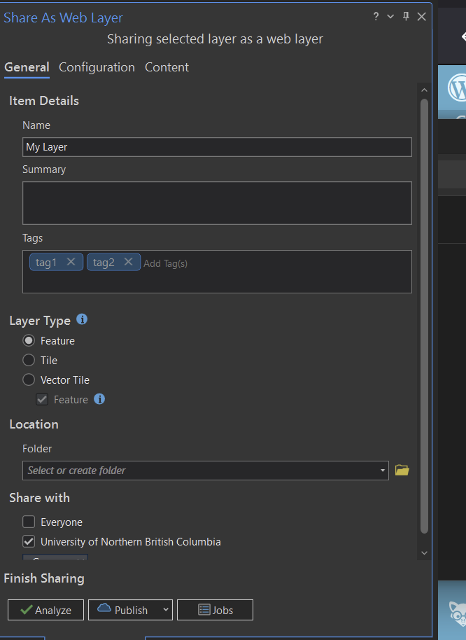
Before the map can be published, we need to specify a few details, including: the name of the map, a brief summary, and a comma separated list of tags (keywords we can use to find the map later.) And we want to set sharing to “University of Northern British Columbia”.
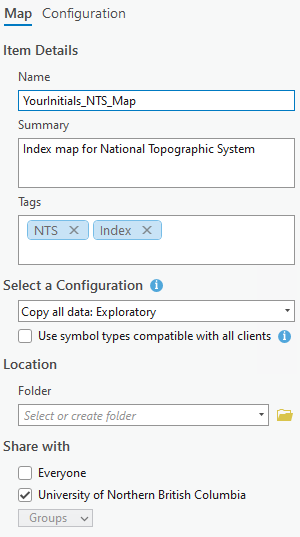
For Location / Portal folder you should see your folder available. Choose that folder.
Once you have these settings, press the analyze button.
You will likely see a couple of warnings here:
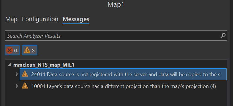
One might say that the Data Source is not registered, and will be copied to the server. Another might say that the projection is different (all web maps will be Mercator, but the NTS shapefiles are Canada Albers)–they will be re-projected on the server, but it will take some extra time to process.
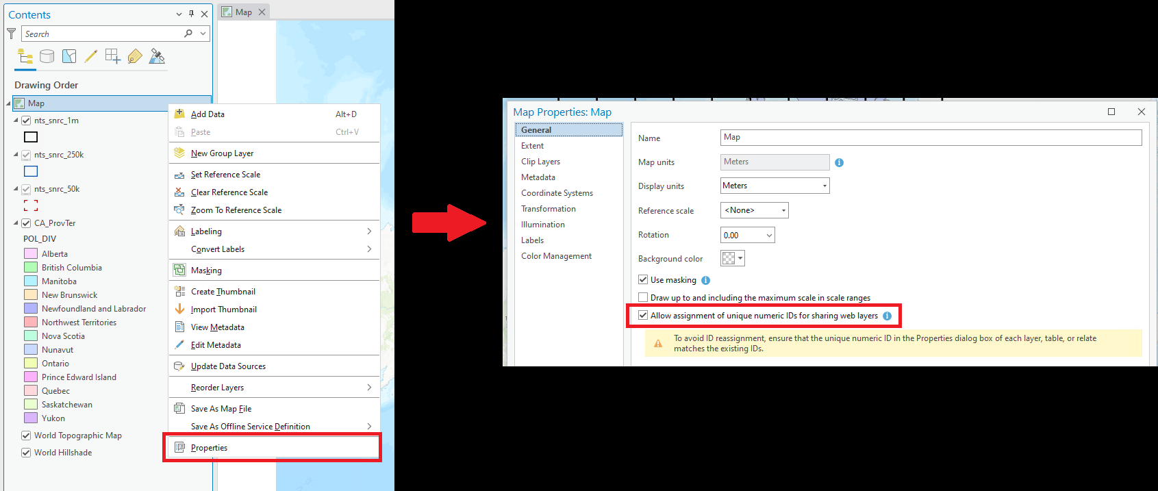
If any errors are present (red X) they will need to be addressed before publishing. It is possible you will see Unique numeric IDs are not assigned. If so, double click on the message and it will open a window allowing you to enable the unique ID’s.
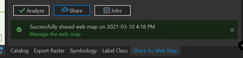
Finally, press Share
It may be a good time to take a break. This is not a very fast process, as all of the layers need to be uploaded to the server and re-projected.
When it is finished you will get a success message. Click on the ‘Manage the web map’ link.
This will open a web page with information about your map. The URL in the web browser can be shared with others allowing them to view your map (you’ll be doing that for the maps you make for your assignment).
To see the map, press “Open in Map Viewer”
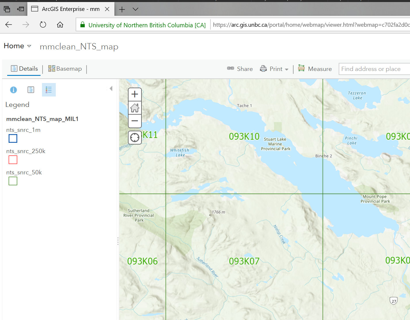
You have now published your first web map!
You will also notice that it loads faster than in ArcGIS Pro, which is largely due to the data being stored in the ArcGIS Online database as opposed to shapefiles.
Publishing Layers
You also have the option of publishing individual layers, which you will be doing for the assignment. This will make the layers available in the portal so they can be used on a variety of maps. This has the advantage that if the layer is updated, all maps that use the layer in the portal will also be updated. Can you think of any downsides of automatic layer updates?
By default, any layers you add from the portal are added to the map by ‘reference’: that is, the data will not be uploaded again when you share your map. Layers added from the filesystem will be uploaded with the map (it is possible to reference these later, however they will contain less metadata). Sharing layers this way also allows you do add additional metadata to your maps, since your whole map will contain metadata, and then your individual layers will also contain their own metadata as well.
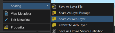
To do this, go back to ArcGIS Pro and right click on the layer you want to upload, choose Sharing, and Share As Web Layer.
*Note that if you want to edit an existing web layer, you could open it, edit in ArcGIS Pro, and then Overwrite Web Layer if you have editing permission on the layer. But a word of caution, this will overwrite the original data and it would likely be wise to save a backup before overwriting.
Otherwise it is the same process of setting a Name, Summary, Tags, and Location (again, your own folder is fine).
Click Analyze to check for errors, and if no errors are present, press Publish.
Clustering Data
Open a New Map within your Lab 7 project, then add
L:\GEOG205\lab05\Lower_Mainland_Crashes_data.csv.
Use the XY Table to Point tool (remember how?) to turn the CSV layer into a point layer.
In the Feature Layer > Drawing section, select Aggregation > Clustering (number 1 on the screenshot below). Once your points have clustered, open the Symbology pane (2), then select the Clusters tab (3):
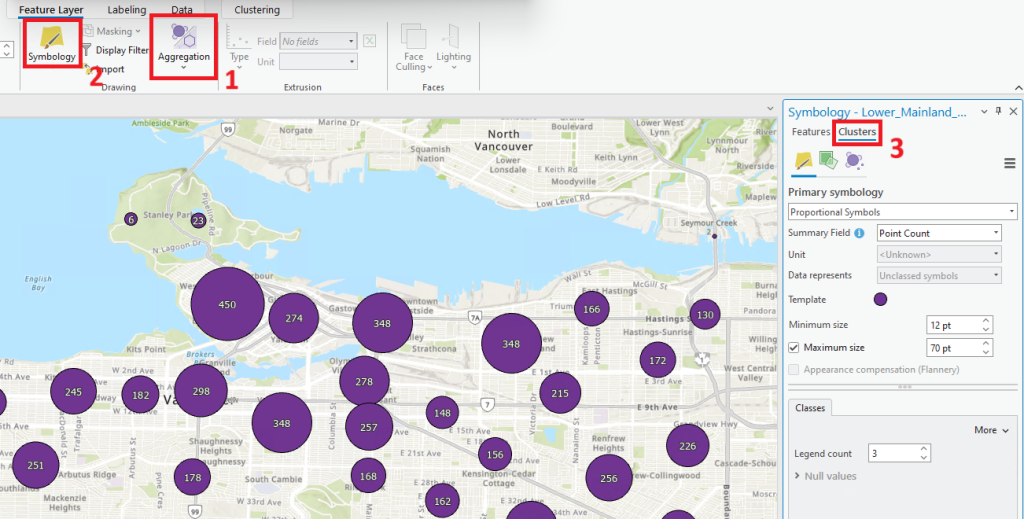
This is where you can adjust the minimum and maximum limits of your point clusters, change the symbology of your clusters (not of the individual points – switch back to Features next to number 3 in the screenshot above to do that), and, in a minute, where you can change what values the clusters display. The Summary Field defaults to Point Count, so the number on each cluster represents the number of points that have been absorbed into a single cluster. Next, we’ll learn how to change that value from Point Count to the sum of the number of crashes within the range of each cluster.
We first need to calculate the sum of the CrashCount:
- Click on the Clustering tab in the top ribbon
- Click on Summary Statistics
- In the Field column, select CrashCount; in the Statistic Type column, select Sum; click OK
- Once the data reloads, change the Summary Field in the Cluster Symbology (still the same symbology panel as in the screenshot above) to Sum CrashCount
- Notice how the values in each cluster have changed
Currently, all of our shapes are circles, and they’re probably all the same colour, too, so it’s hard to tell the clusters apart from any individual points. Zoom in a bit until you can see a few individual points and a few clusters at the same time. Next, change the style of your individual points to something other than a circle. You can do this in two ways:
- Click on the circle icon beneath ‘Features’ but above ‘Clusters’ in the table of contents, or
- Click the Features tab in the Symbology panel, then click the circle next to ‘Symbol’
Now, change the point symbology like you would for any other point layer, using the Gallery or the Properties tabs. Is it easier to tell the individual points from the clusters now?
Turn on labeling for the individual points to display the crash count when those individual points are in view. How would you go about doing that? Pretend the clusters don’t exist, as the steps are the same either way.
TIP: You can also jump to the different sections of the Symbology tab by clicking either ‘Features’ or ‘Clusters’ in the table of contents. This can help you differentiate what symbology you are editing.
Let’s test out this tip. Click on ‘Clusters’ in the table of contents. In the Symbology pane, click on the green square icon (‘Vary symbology by attribute’). Expand ‘Color,’ then set the Summary Field to Sum CrashCount. Select a colour scheme that seems appropriate to the dataset (remember some of the theory we’ve discussed about colour choice in previous labs).
To adjust how large an area each cluster covers or reaches to, in the Cluster Symbology, click on the third icon, the purple circle that looks like people sitting around a table (‘Cluster settings’). Adjust the Clustering radius from low to high to see how this affects the visibility of the map. Usually the ‘sweet spot’ will be something where the radius is large enough that almost no circles overlap, yet low enough to still provide meaningful information about the distribution of points on the map. Notice too how this changes as you zoom all the way in to see individual points, and as you zoom all the way out until you see only a few clusters. Make sure the clustering radius that you choose is most useful in most cases – it is probably fairly unlikely that users will be viewing a map containing data about the lower mainland at a scale that shows even all the way out to the Fraser Valley or Vancouver Island, so it doesn’t really matter if your clusters don’t look great at that scale.
On this same Cluster settings tab, we can adjust the text symbology for the counts that are displayed on each cluster. The Cluster Text Field, when set to Sum CrashCount, will show how many car crashes are included in each cluster. Clicking on the arrow next to the ‘Aa’ of the Template and selecting ‘Format text symbol’ will allow you to change the font size and colour as well as add or remove outlines and halos.
As we’ve done before, choose your desired starting extent (that is, the position you want your map to default to when users open your map), then publish your map to the web. Since this takes a while, you don’t have to actually publish this map unless you want the practice.
Assignment 7
For this week, please make sure to read the entire assignment before beginning. Pay special attention to the details. When web-mapping, the metadata (data about the data) is essential to producing quality results. For the web-maps, while you will still be marked on choosing colours that are easily visible, the creative possibilities will be more limited. Recording accurate information about your layers, however, will be essential, and carry a heavy weight on your mark.
Submit the URLs to the maps you create in the comment box for the Lab 7 Assignment in Moodle.
A note about tags: Each of your maps should include a few relevant tags, but also be sure to include one of the following tags based on which lab section you are registered in. Copy/pasting is encouraged to avoid typos!
GEOG205_2025_Tues
GEOG205_2025_Wed
GEOG205_2025_Fri
Part 1 (Map of Kamloops)
For part one, you will be downloading data from the city of Kamloops (at least 2 layers).
https://mydata-kamloops.opendata.arcgis.com/
Some potential ideas would be (though don’t feel limited to these if you have another map you would like to make):
- Parks and Trails
- Water Network, Sewage System, and Telephone lines
- 200 year flood plane, and cadestral lots
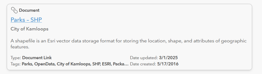
Try to choose layers that have something to do with one another, or that fit into a kind of ‘theme’ for your map (for example, Municipal Recreation Offerings, Municipal Services, or Property Flood Risk for the ideas above). It may be helpful to search for “shapefile” on the Kamloops OpenData site. It appears that now, much of the Kamloops data come as a collection of related shapefiles, so you may find it’s enough to download something with a naming structure of “[filename] – SHP” like the example below:
- Download your desired layers, find the zipped/compressed file in your Downloads folder, right-click on it, select Extract All, and have the extracted files go to your K: drive.
- Open the desired layers in ArcGIS Pro and style them as you like
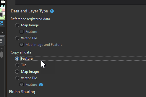
- From ArcGIS Pro, share your layers to the UNBC ArcGIS Online Portal by right clicking on each layer and going to Sharing > Share as Web Layer. Your data must have a proper title, tags that at least include ‘Kamloops,’ the appropriate tag listed above for your lab section, and a couple of tags that describe the layer; as well as a summary of what the data is. Change the Data and Layer Type to “Feature” to keep the symbology editable.
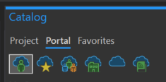
3. After your layers have been published, you’ll want to remove the layers you were first working with, then go find the layers you published in the Portal tab of the Catalog. Add those layers you published back to your project from the Portal. This will avoid needing to re-upload the data when you publish your map, and adds an additional layer of metadata to your finished web map.
4. Adjust the symbology to something you are happy with, and navigate to the extent you would like users to see when they first open your map.
5. Publish your web map. Again your data must have the tags: Kamloops, the correct tag for your lab section (listed above), and a few relevant descriptive tags; fill out as much of the metadata as you can (tip: the data that you downloaded came from the City of Kamloops… where could you put that in the metadata?).
6. Test the URL to make sure the map works as expected, then submit the URL to Moodle (submit both web links in a single comment in the comment/text box for Lab 7).
Part 2 (Map of Earthquakes in Peru)
In ArcGIS Pro, make a map showing the earthquakes in Peru.
The map should have tags that at least include ‘Peru’ and the appropriate tag listed above for your lab section, but should also have a few descriptive tags as well.
Add the layer eventos_sismicos from L:\GEOG205\lab05\Assignment\eventos_sismicos.
Your map should be symbolized based on two attributes:
First, turn on Clustering. In Feature Symbology, symbolize your layer using Proportional Symbols. Staying in the Features tab, set the Fied to “magni_1”, and then in the next tab (the green square), Vary symbology by attribute using Color, with the field set to “año.” Choose a colour scheme that is suitable to the given dataset, again considering the theories we’ve discussed previously.
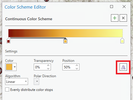
Note that, if you wish, it is possible to reverse a given colour scheme by clicking the drop down menu by the colour scheme, selecting ‘Format color scheme…’ and clicking the ‘Reverse color scheme’ icon:
Remember that the changes you’ve made so far apply to the individual features/points, and not the clusters. Switching to the Clusters tab in the Symbology panel will allow you to make symbology changes to your clusters. There’s no need to vary the Cluster symbology by attribute in this case.
Add labels for magnitude to the individual events (again, like we do for normal labels in the Labeling tab). These labels may not show up in ArcGIS Pro for some reason, but they will show up on the web viewer, so as long as you’ve done the steps, you should be able to trust that they worked. For label placement, choose either Basic Point, or Basic Offset Point.
Save, then enable Sharing of your map. Ignore any warnings that warn about the downgrading of clustering visualization.
After you have tested the URL, include it in the moodle submission. Remember your TA will only be able to view your map if you have shared with University of Northern British Columbia.
** Two notes about testing the URLs of your maps: **
- Click the green link in the success message once your map is done uploading. Make sure it takes you to a webpage that shows the metadata of your map. Don’t worry if the map itself doesn’t display properly on the web.
- Anywhere on that webpage with the metadata that has a pencil is editable for you. Take advantage of this – add as much metadata as you have information for.