1. Examining Satellite Images
In this section, you will be working with Sentinel-2 satellite imagery. Where most images you see contain Red, Green, and Blue (more commonly known as RGB), the Sentinel-2 images contain 13 bands. The full list of bands is available from the European Space Agency: https://gisgeography.com/sentinel-2-bands-combinations/
| Sentinel-2 Bands | Central Wavelength (µm) | Resolution (m) |
|---|---|---|
| Band 1 – Coastal aerosol | 0.443 | 60 |
| Band 2 – Blue | 0.490 | 10 |
| Band 3 – Green | 0.560 | 10 |
| Band 4 – Red | 0.665 | 10 |
| Band 5 – Vegetation Red Edge | 0.705 | 20 |
| Band 6 – Vegetation Red Edge | 0.740 | 20 |
| Band 7 – Vegetation Red Edge | 0.783 | 20 |
| Band 8 – NIR | 0.842 | 10 |
| Band 8A – NIR | 0.865 | 20 |
| Band 9 – Water vapour | 0.945 | 60 |
| Band 10 – SWIR – Cirrus | 1.375 | 60 |
| Band 11 – SWIR | 1.610 | 20 |
| Band 12 – SWIR | 2.190 | 20 |
As humans we only see 3 colours, Blue, Green, and Red, however, we can use the computer to move other bands into one of these spectra that we can see. Let’s take a look at a satellite image. If you want to acquire your own satellite images, they can be downloaded free of charge from Open Access Hub:
https://browser.dataspace.copernicus.eu/
When you download the imagery it actually comes as a collection of files. In windows file explorer, take a look at this directory:
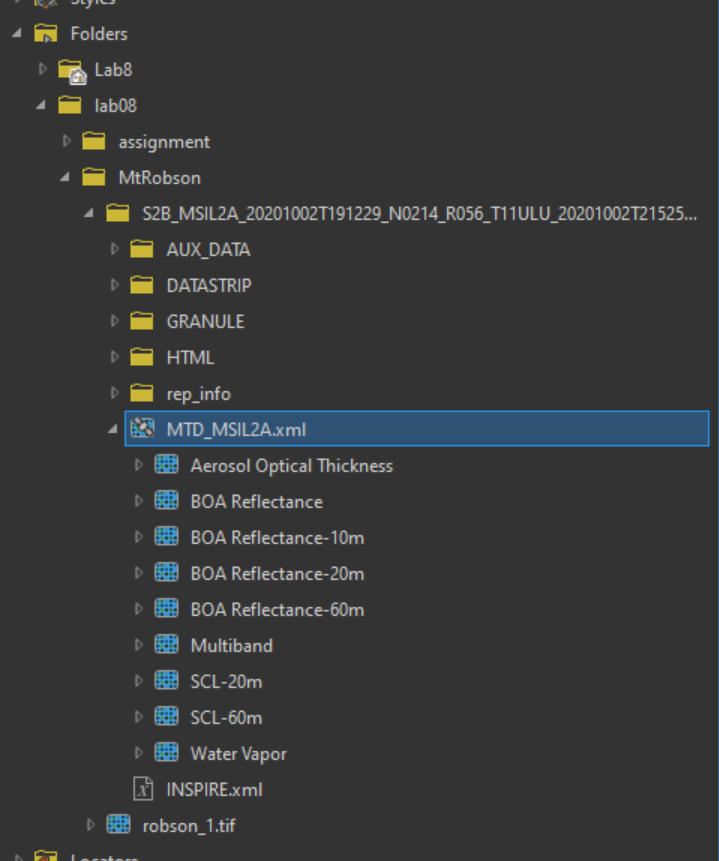
L:\GEOG205\lab08\MtRobson\S2B_MSIL2A_20201002T191229_N0214_R056_T11ULU_20201002T215256.SAFE
If you look around inside of the GRANULE/L2A_T11…/IMG_DATA/ subfolder, you will find the images sorted into folders for each resolution, and a JPEG 2000 (.jp2) file for each band. However we do not want to add bands one file at a time, we will make use of meta files, files that store information about the other files.
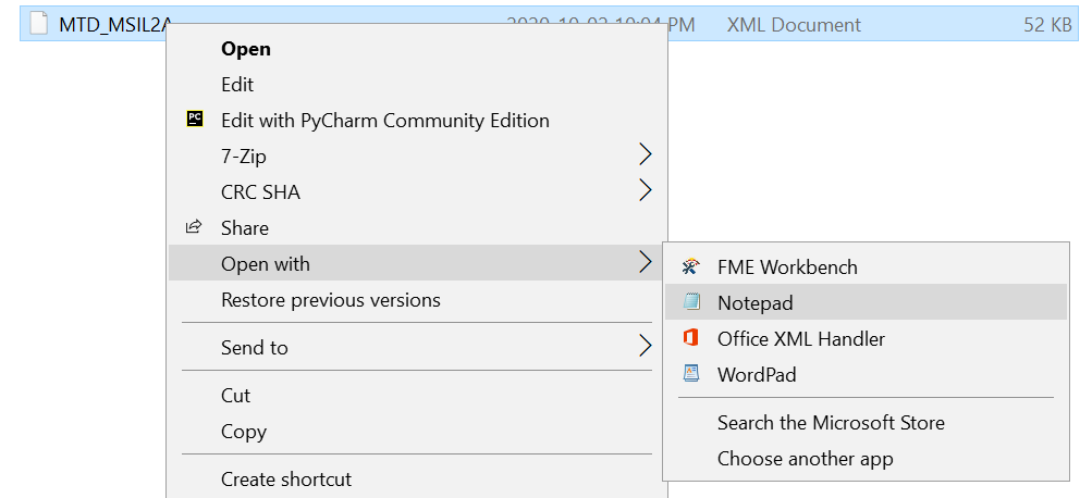
If you are really nerdy and what to know what a meta file looks like you can open MTD_MSIL2A.xml in notepad.
For the metafiles to work correctly we must add the file through the catalogue pane, as dragging and dropping from windows file explorer will not produce the desired results.
Start a new ArcGIS Pro project and add a new folder connection for L:\GEOG205\lab08
As you expand the directory tree in ArcGIS Pro you will notice a layer of files below the XML files, these represent the processes for opening the imagery.
These all represent different views of the data useful for a variety of Remote Sensing tasks (Take GEOG 357 if you want to learn more).
For now we are only interested in the BOA (Bottom of Atmosphere) Reflectance. There are 4 variations of this: the first one contains all 13 bands, and the following options contain only the bands of the specified resolution.
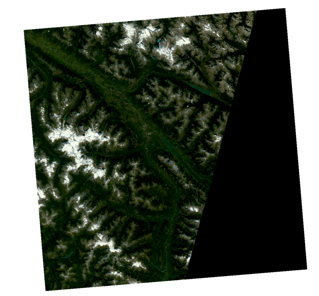
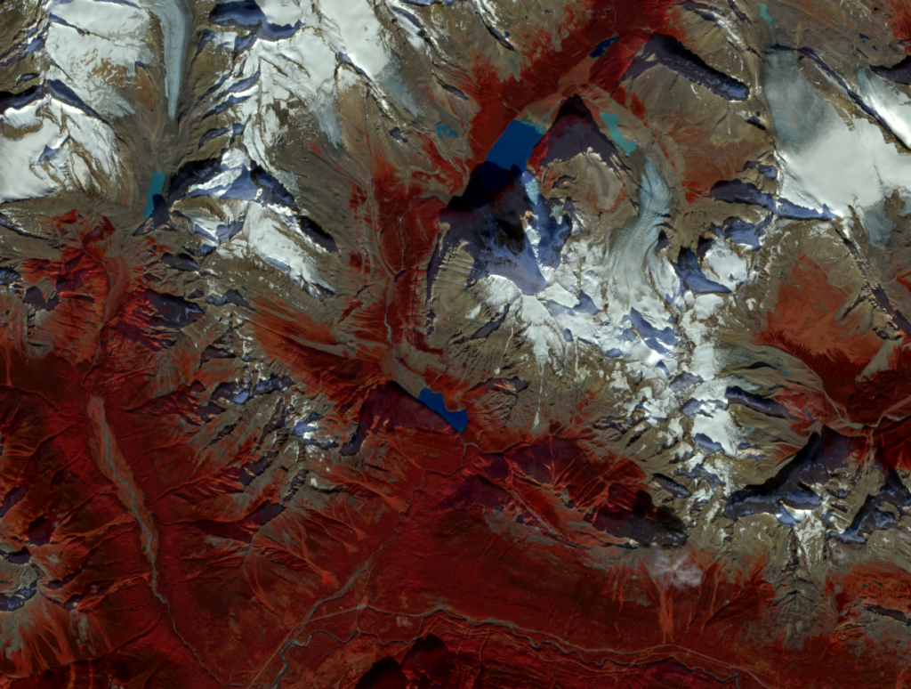
Add the BOA Reflectance that contains all 13 bands to your project. (This is a relatively large set of files, just under 1GB, so give it a few seconds to load). If all goes according to plan you should see an image like this:
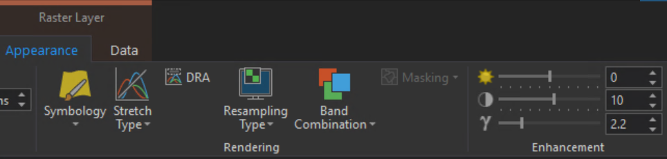
Next, we will look at some ways of altering the appearance of this image. With the image selected, open the ‘Raster Layer’ tab. We are interested in the Rendering Section (*If your image opened very dark, set the gamma to 2.2 in the enhancement).
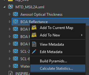
Note that all the data for this lab has already been prepared for stretching, a process that took roughly 45 minutes to complete (a ‘press start and work on something else’ sort of process). If you were to download a fresh set of imagery, and it appears very dark (or totally black), you would need to right click the layer and select “Calculate Statistics.”
Stretch Type:
In a typical image you see on the computer screen, the image is a grid of pixels. Each pixel has a digital number that represents its colour: Older images were 8-bit (i.e. range from 0-255, where 0 = no reflection/dark and 255 = high reflection/bright). The data from Sentinel is 12-bit (2^12) data ranging from 0-4095, and the stretch affects how we map these values down to the 0-1023 (10-bit) range that our new monitors can display, or down to the 0-255 range that older monitors can display.
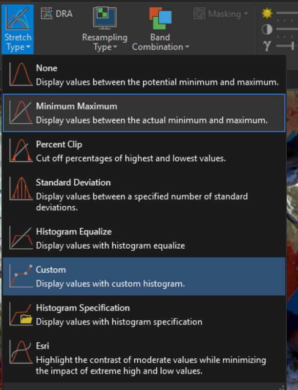
Setting the stretch to none performs a linear mapping where 4095 -> 255, 2048 -> 128, and 0 -> 0. But what if the data in our image doesn’t actually extend across the 0-4095 range?
This is where stretching comes in, as it allows us to make the most of the display’s range. Try a few different Stretch Types to see how they affect the display.
DRA:
Dynamic Range Adjustment: when this option is enabled, the stretch is performed over only the visible pixels on the screen. This allows the contrast to increase as you zoom in on the image.
Resampling Type:
When zoomed out on the map, there will be multiple pixels mapped to each pixel on the screen. The resampling type affects how they are mapped. The simplest form is the nearest neighbour. In this strategy, the pixel that is closest to the center of the pixel on the display is shown. The other strategies will provide averages of the pixels in the neighbourhood, producing smoother and potentially more accurate (though still generalized) results.
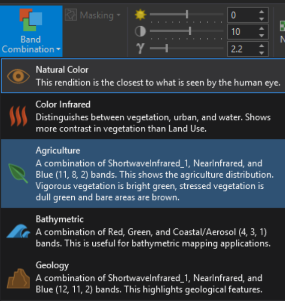
Band Combination:
Band Combination provides quick access to commonly used arrangement bands, listed by use. Because of the metafiles, ArcGIS Pro understands what each band represents (this will change with various satellite platforms), and this provides a quick way of getting a relatively consistent display. Try looking at a few and see how each combination emphasizes different features.
Brightness / Contrast / Gamma:
These provide some basic controls in how the image is displayed on the monitor. Note here that brightness and contrast have neutral values of 0 and 10 respectively, where the gamma default is at 2.2 (There is no need to understand why, but if you are curious there is more information on gamma available here: https://en.wikipedia.org/wiki/Gamma_correction).
Exporting data for use in other software
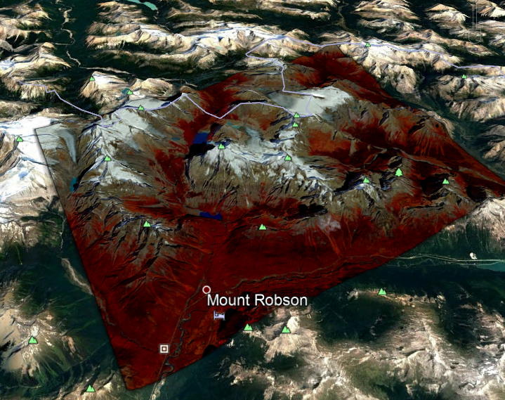
Zoom into Mt Robson in the North centre of the image (use the base map for help, or see below image for a reference of the area that should be visible.)
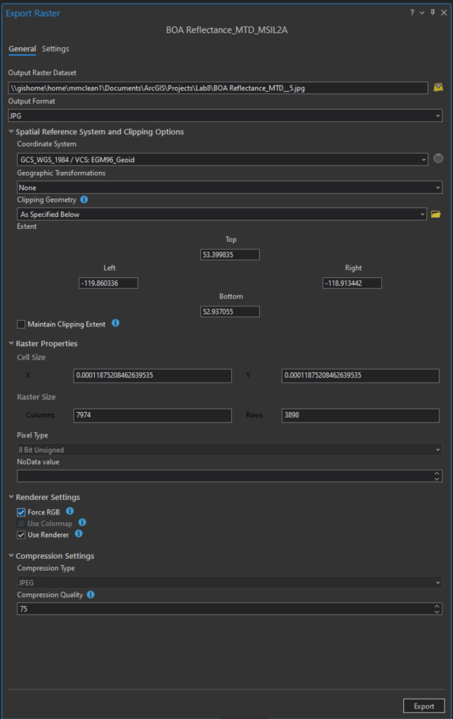
Now we are going to export this image as Raster (Right click on the layer in drawing order > Data Export Raster)
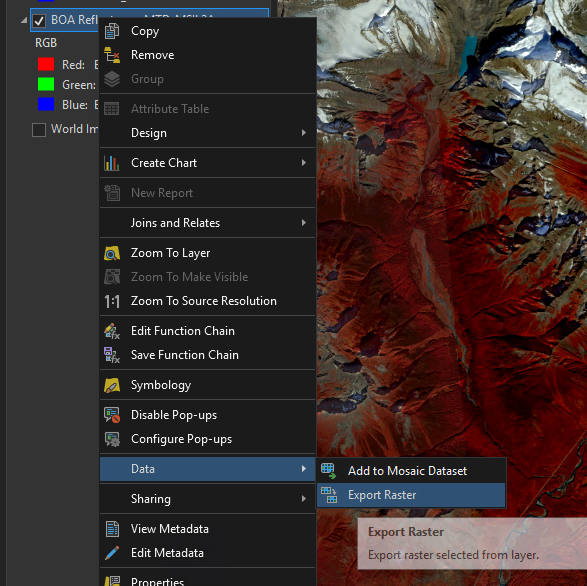
Export Raster
- Set the output Raster Dataset to a location inside your K: drive/Lab 8 folder. Name the file with a .jpg file extension.
- Set the desired coordinate reference system: WGS 1984 (4326).
- In the Clipping Geometry drop down select “Current Display Extent.”
- Select ‘Use Renderer’: This option will preserve the stretch and band combination we have chosen.
- Force RGB (this makes sure only 3 bands are exported).
- Click Export.
- Don’t worry when the exported image displays oddly in ArcGIS Pro – we exported this to use in Google Earth, which we’ll get to next.
2. Working with Google Earth
Google Earth overlays satellite imagery, aerial photography and GIS information over a 3D model of the Earth. It allows users to search for addresses, enter coordinates, or simply use the mouse to browse to a location. Google Earth enables the user to view satellite images, layers of data provided by Google and by the Internet community at large. Google Earth also has 3D terrain data collected by NASA’s space shuttle and available in the public domain. In addition, Google has provided a layer allowing one to see 3D buildings for some major cities.
On your personal computer, the Google Earth application can be downloaded from https://www.google.com/earth/versions/#earth-pro, but the lab computers already have Google Earth installed.
Add Imagery to Google Earth Pro
Open Google Earth Pro (desktop icon, or from the start menu). Click whatever you need to to dismiss any warnings about graphics cards. Restart Google Earth if you need to.
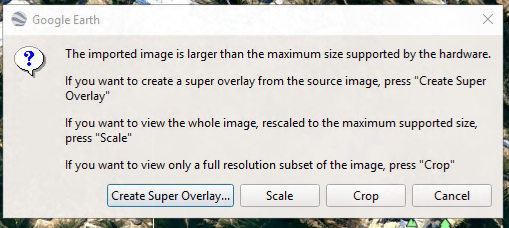
In the Windows File Explorer, find the .jpg image you just exported and drag it into to Google Earth. You will first see a message saying flying to location. We only need to use the regular JPEG file, however you may notice some other files with the same file name, but different file extensions. These other files contain the georeferencing data in a similar way to shapefiles–Google Earth looks in the same place the main JPEG came from to find the other files (.jgw, .jpg.aux.xml, .jpg.ovr) that contain the information it needs to display the image in the correct location.
You will then be prompted with a message saying the image is larger than the maximum supported size, choose to Create Super Overlay, and in the file browser that opens, select your lab08 folder as the location for your Mt Robson overlay file (called something like Robson_overlay). If the super overlay takes too long, you can cancel and attempt again by selecting Scale. This will not be as sharp, but it will process faster.
Once it has had time to make the super overlay, you should see it appear inside of Google Earth.
You should notice that 3D navigation is somewhat faster than it was in ArcGIS Pro, however you may also notice some artifacts (visual glitches that are not meant to be there) in the images–Google Earth has some pros and cons.
Annotations with Google Earth
Google Earth is most commonly used for quickly marking up imagery. Above the map you will see tools for creating Placemarks (points), Polygons, and Paths (lines).
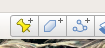
Start by clicking on the yellow push pin, then click somewhere on the map. This will create the point, and a dialogue opens.
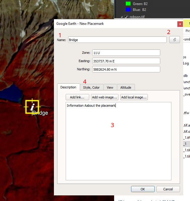
- The name field is used to label the point you just placed.
- Click the yellow pushpin icon on the dialog box to change the symbology of your icon
- Description is used to add additional information about the placemark that can be seen by clicking on the point.
- Style and Color provide some additional options related to the symbol and label.
- Click and drag the placemark’s square yellow target anywhere you want on the map.
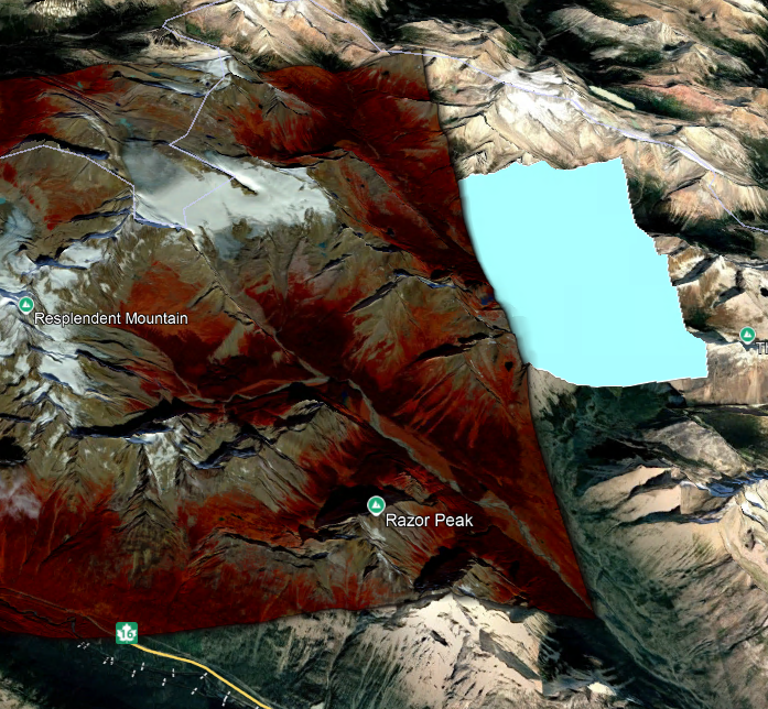
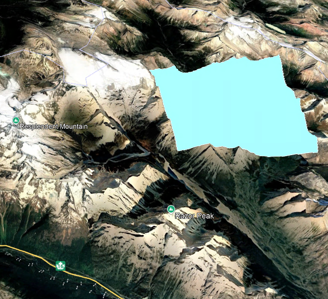
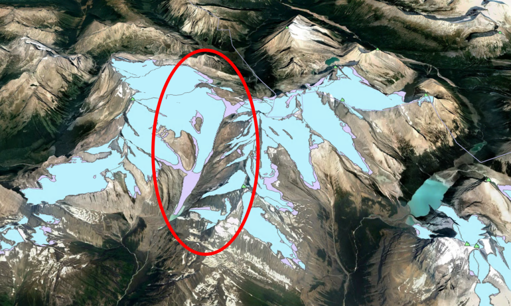
A note about polygon features:
Due to the way the layers are rendered, polygons will always be drawn below draped imagery. For this reason if you are using draped imagery (like the 2.5D look we are using in Google Earth now), polygons should be avoided. See the example below:
Historical Imagery
Another very helpful feature in Google Earth is the ability to view historical scenes. This provides an easy way to look at changes over time on the landscape. This can be done with the clock button.

Take a look at your favorite vacation spot, and see how the landscape has changed over the years.
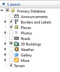
Adding other layers to the map:
In the lower left corner you will see a layers panel. You can use this to add pre-existing labels and placemarkers for a variety of different data sources.
Exporting Your Layers
You can export individual features by right clicking and choosing Save Place As…
You will be given options for KML or KMZ (KMZ is a compressed KML)
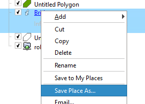
You can also select a folder, like the default ‘Temporary Places’ folder, and Save the Entire Folder as a KML allowing for multiple features or layers to be exported to a single file.
Exporting your image map
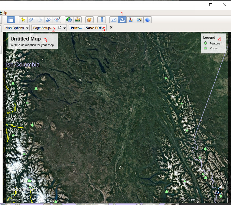
Exporting maps from Google Earth is very simple compared to ArcGIS Pro, but also comes at the cost of customization.
- Clicking on the print icon will open the rest of your print options.
- Page Setup is where you pick your page size – select your page size and orientation, click OK, then click and drag your map until you get the layout you’d like to export.
- Add a title, as well as a description including your name and date the map was produced.
- You can turn off any features from the Legend should you not want them.
- Either send it to your printer or save it as a PDF.
Assignment 8:
This week’s assignment is split into two parts. Both parts should be submitted as a PDF file using landscape oriented letter sized paper.
Part 1:
Sticking with the Mount Robson theme for now, create an image map in Google Earth that shows the retreat of the the Swift Current Glacier (take note) near Mount Robson, BC.
Inside of the assignment folder you will find robson-glacier-extents. You will need to convert these shapefiles to KML/KMZ before opening in Google Earth. You will find a tool called Layer to KML in the Analysis Toolbox. Click here if you want to learn more about the tool.
*Note that in Google Earth, the Drawing order is not determined by the order files appear in the legend, but rather by the order in which the files are added to Google Earth, with the most recent file on top. Make sure that the more recent glacier extent image is on top.
Your image map should include the usual: Title, Description, Name, Date, and Legend.
Part 2:
In the assignment folder, there is a Sentinel-2 (S2B_MSIL2A_2020….) Image from west of Edmonton, Alberta. For this assignment, you will need to make a simple map using only this image as a single layer. However, the Legend will be less straightforward than normal, as ArcGIS will not create a legend for raster layers. You will need to utilize the Graphics (e.g., shapes) and Text features to manually create a legend that will provide meaning to the readers of your map.
Zoom in on a portion of the map where the fields can be clearly seen (roughly 1:100,000) – you can pick any area that looks interesting. Set the stretch and band combination to show the Agriculture well.
HINT: If the colours on your layout look darker than your map, try “Esri” for Stretch type.
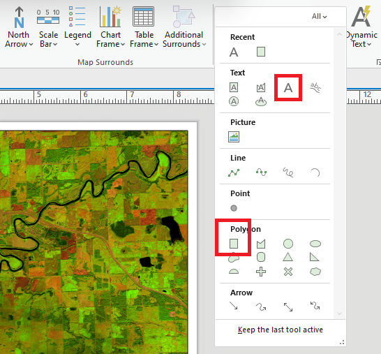
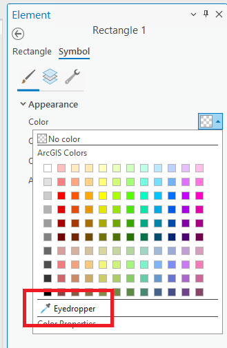
Using the agricultural band combination, water will appear as black, vegetation green, and bare earth as brown (possibly with a magenta tint). Use the Graphics and Text controls to manually make a legend to show at least these three categories of ground cover. One possible solution is to make three rectangles (see Tip #1 below), and fill each with a colour similar to what appears on the map (this is a good opportunity to try the eyedropper tool – see Tip #2 below), and putting a text label beside.
Make the Layout for Landscape Letter size paper including your map frame, a handmade legend, Title, Name, Date, Scale Bar, and Locator Map (See the Lab 4 instructions for a reminder of how to do this; you may wish to use the ‘CA_ProvTer’ layer from Lab 5, and don’t change the projection). Don’t forget that this imagery comes from Alberta, not British Columbia.
Export your map as a PDF.
Tip #1: The tools you may want to use to create your handmade legend:
Tip #2: The eyedropper tool
Upload the two PDFs to Moodle.