- Introduction
- A Note About Today’s Datasets:
- 1. Nominal/Categorical Symbology
- Choosing Colours for Nominal Data:
- 2. Symbolizing Areas by Quantities
- Normalizing Data for Display
- Conveying meaning with colour
- 3. Proportional Symbols
- ArcGIS Pro Proportional Symbols
- ArcGIS Pro Graduated Symbols
- Charts
- Using both Scale and Colour
- 4. Heat Maps
- Supplemental Information (not required):
- Assignment 5
- 1. Quantity Map of Canada Median Income 2015
- 2. Heat Map of Peru Seismic Events
Introduction
Thematic Maps offer one of the greatest potentials for creativity in maps. You can think of them a lot like info-graphics with location information. Making truly great thematic maps is an art form and requires a great deal of skill to fully master. Where most of the maps we have been using in the course so far seek to express information about where things are and how to get there, thematic maps will strive to provide information about a location that is easy to digest by making use of symbol hierarchy, colour choices, and embedded charts.
An ideal thematic map will convey its meaning intuitively. While a legend will still be present, it shouldn’t be needed to understand the essence of the map. A truly great thematic map would then seamlessly blend into the medium where it is presented, matching styles of surrounding elements.
A Note About Today’s Datasets:
We’ll be making a few modifications on today’s datasets, so rather than copying and pasting every file as we need them, let’s copy the entire L:/GEOG205/Lab05 folder to your own GEOG205 folder on your K: drive. To help tell the folders apart, rename that copied folder in your K: drive to something like ‘CopiedLab05’ or ‘MyLab05Content.’
1. Nominal/Categorical Symbology
Choosing Colours for Nominal Data:
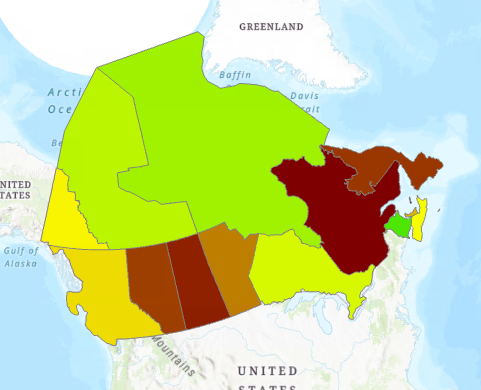
Do not use varying shades of one colour in a nominal symbol fill set (for example, multiple shades of green) since increasingly darker shades of one colour are used to symbolize magnitude (interval) data as “darker” means “more” (keep this information in mind when you get to your assignment).
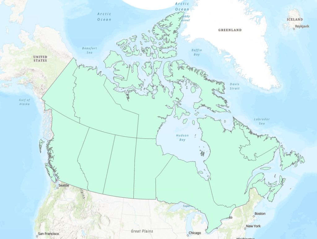
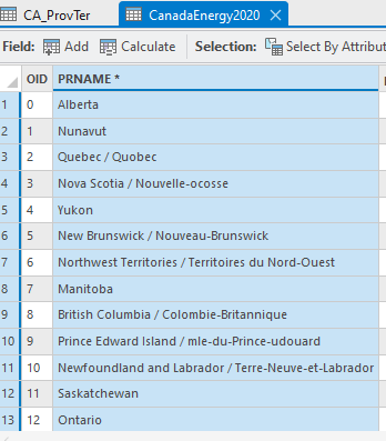
As an example of this, open the ‘CA_ProvTer’ shapefile from your copied Lab 05 folder.
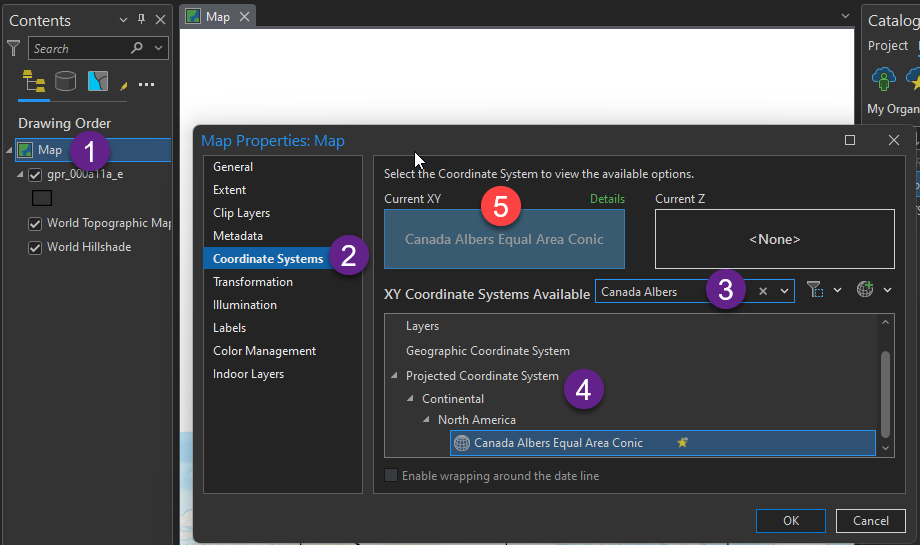
Next lets take a look at our map projection: your map file may be presented more rectangular than we are used to seeing maps of Canada. We will fix this by changing the map’s projection. Note that layers in your project, and the map in the drawing order can have different projections. ArcGIS will convert the layer projections in real time to match the map.
Double click on Map in the Drawing Order to open properties. Under Coordinate Systems, search for Canada Albers, find Canada Albers Equal Area Conic in the list under Projected Coordinate System, select it, confirm Current XY has been updated (see point 5 in the screenshot below), and press OK.
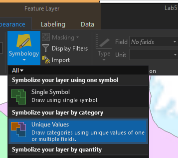
Now it is time to symbolize the layer, first using nominal coloring.
Select the CA_ProvTer layer in the contents pane, and find Symbology in the Feature Layer tab, choose (under ‘Symbolize your layer by category’) Unique Values
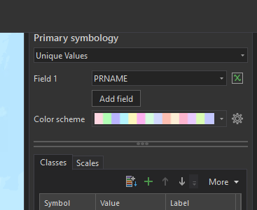
Set Field 1 to PRNAME
This doesn’t display any more information than before, but the random colours add more contrast between the provinces and should seem very familiar to the type of national maps you may have seen in primary school. ArcGIS provides a variety of colour schemes that can be used. The default provided is appropriate for nominal data, however there are many more in the drop-down, or you can build your own using the gear icon.
2. Symbolizing Areas by Quantities
Next, we will examine how colour can be used to provide additional meaning to the data on the map. In GIS, the attributes we will be using for styling can come in two primary ways. The first is as an attribute of the polygons that you would find in the attribute table for the layer you are styling. The second way, as is provided to us by Stats Canada, has the attributes in a separate data table that can be linked in GIS software to the geometry.
A great reason that we might want to use data in this way is that the boundary files can be used with a variety of statistics, and for simplicity, we may not want to have hundreds of attributes saved to the geometry. Instead, we may want to add only the information that we need.
You don’t need it today, but for future reference, these data can be downloaded from here:
https://www12.statcan.gc.ca/census-recensement/2021/dp-pd/index-eng.cfm
Next, we will get the actual thematic data. This generally comes in the form of a spreadsheet (remember the CSV files from Lab 3), or in this case, we will be using an ESRI DBF table. In shapefiles, the attribute table is stored as a .dbf file.
Find the CanadaEnergy2020 table in your copied Lab 05 folder.
At this stage, the Drawing Order of your map should appear as below
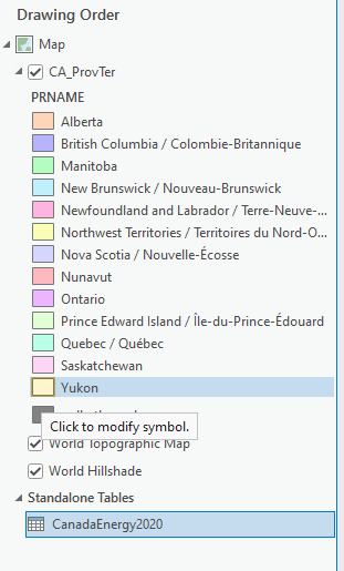
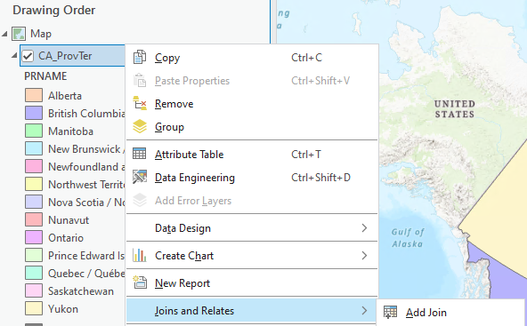
Notice that the CanadaEnergy2020 is listed as a stand-alone table. This, like the .csv file we imported in Lab 3, is because there is no spatial information associated with this layer. To draw this on the map, we need to “join” our layers together. Right-click on CA_ProvTer, find Joins and Relates > Add a Join.
The Join tool will take two tables that each have a column with exactly the same text, and will add the columns of the Join Table to the end of the Input Table (see a screenshot of the Join window below). Note that this is case sensitive, so when you download your data you may need to edit names to match the boundary files that you have.
For our case, the PRNAME column exists in both tables so we will join them based on this. Note that the “Input Table” should be your layer that has spatial data (e.g., polygons) that you want to add the standalone table to.
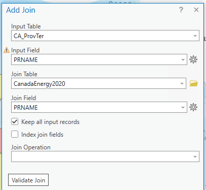
Press OK, then open the attribute tables for each layer and confirm that the columns from CanadaEnergy2020 have been added to the right-hand side of the CA_ProvTer attribute table.
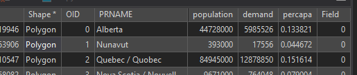
You may notice that you have some <Null> values in your attribute table: these are the result of join fields that do not match perfectly. Which provinces didn’t match between the two tables? Compare the PRNAME fields in each table (make sure you’re looking at the first/left-most occurrence of the PRNAME field in the CA_ProvTer attribute table). Do you notice the typos?
To fix this, we’ll do two things.
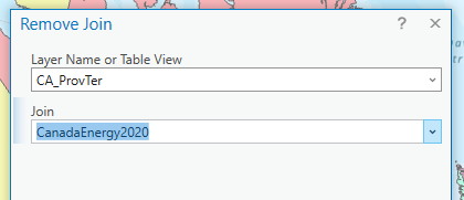
- Remove the join we just did:
- Right click on CA_ProvTer > Joins and Relates > Remove Join
2. Correct the misspelled PRNAMEs by copying the correct spellings from the CA_ProvTer PRNAME field (right click the desired cell > Copy) and pasting them into the CanadaEnergy2020 PRNAME field (right click the desired cell > Paste). Make sure to SAVE EDITS (the big save button in the Edit tab of the ribbon) before proceeding.
Try the join again. See how important attention to detail is in cartography and GIS?
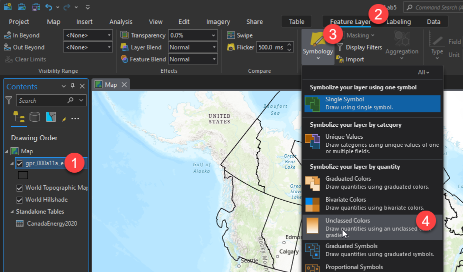
Now let’s get back to styling the CA_ProvTer layer.
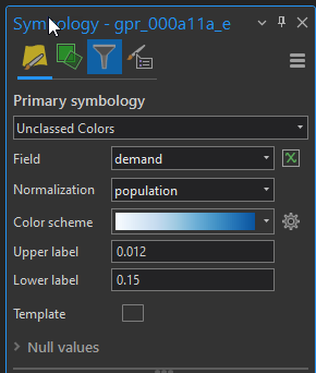
Go to Feature Layer > Symbology > Unclassed Colors
To visualize the energy demand for each province, set the field to demand:
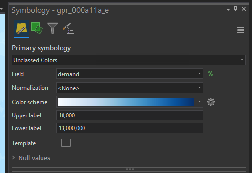
Now when you look at your map you should see the first problem that comes up when working with this type of data. The Territories all appear white, and Saskatchewan and Manitoba both appear in the same shade of light blue. What the map is really showing us at this point is how uneven the spread of population is across Canada, because it shows us total energy demand per province, regardless of how many people live there. Whenever you are working with this type of data, take a moment to consider what variables may be driving the numbers you are trying to graph.
To make this map a little bit more interesting, change the field to “percapa”. This field shows the energy used per person in each province in 2020 (note that no units of energy were provided with this dataset).
Normalizing Data for Display
This data was provided to us already normalized, however this will not always be the case. An alternative option would be to set the Field back to ‘demand’ and then manually normalizing it against the population by setting the Normalization value to ‘population.’
Conveying meaning with colour
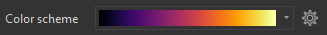
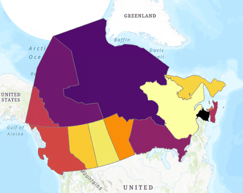
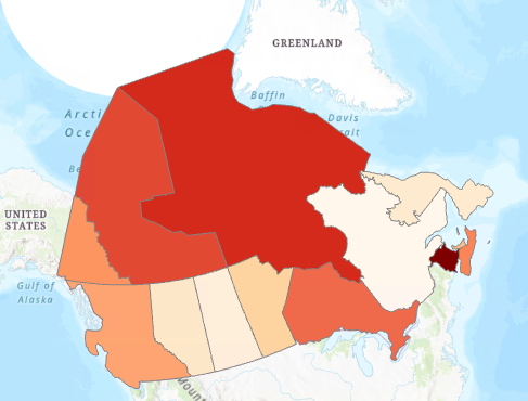
Next we will look at the Color Scheme. You can pick from several options in the drop-down menu, or click ‘Format Colour Scheme’ at the bottom of the drop-down to be given a window that allows you to select custom colours at intervals across the gradient. When choosing your colour scheme, your primary focus should be that the colours are intuitive. Going from green to red will convey a very different meaning than if you go from red to green. Secondly, you should pick a Color Scheme that fits the theme of your map. And remember: ‘darker’ values generally mean ‘more.’
Lets look at a couple of examples below that show how a poor choice can show the wrong message:
3. Proportional Symbols
- Symbol size should reflect the values being represented.
- All symbols should be visible. The smallest symbols should be larger than dots.
- Where there is overlap, if any, the smaller symbols should retain their outline to give the visual impression of being on top.
- The circle is the standard proportional symbol, but in some cases, other shapes may work better.
ArcGIS Pro Proportional Symbols
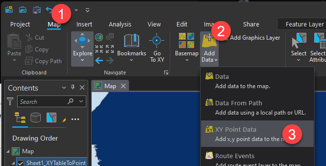
To take a look at proportional symbols, we are going to add some XY data to our map. You will find the layer under [yourcopiedLab5Folder]\postsecondary\NewBrunswickUniversities.xlsx\Sheet1$. You will need to access this through the catalog pane. Much like how Windows views a geodatabase with the .gdb extension as a ‘file’, Excel files are not opened directly in ArcGIS. Rather, the catalog will allow the opening of specific sheets inside of the workbook.
Find the NewBrunswickUniversities.xlsx file, then expand the arrow next to it to reveal the sheets inside. Drag the Sheet1$ layer into your project.
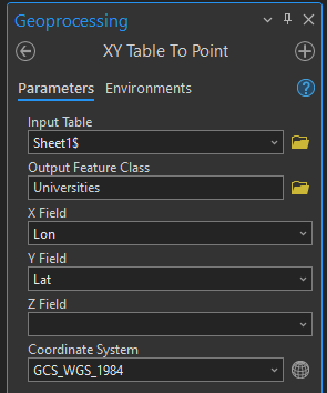
Add the university points to the layer using the XY Table To Point tool like we did in Lab 3. Note that you cannot drag-and-drop XY data directly onto ArcGIS Pro (because it will only appear as a Standalone Table – you’ll still need to run the XY Table To Point tool).
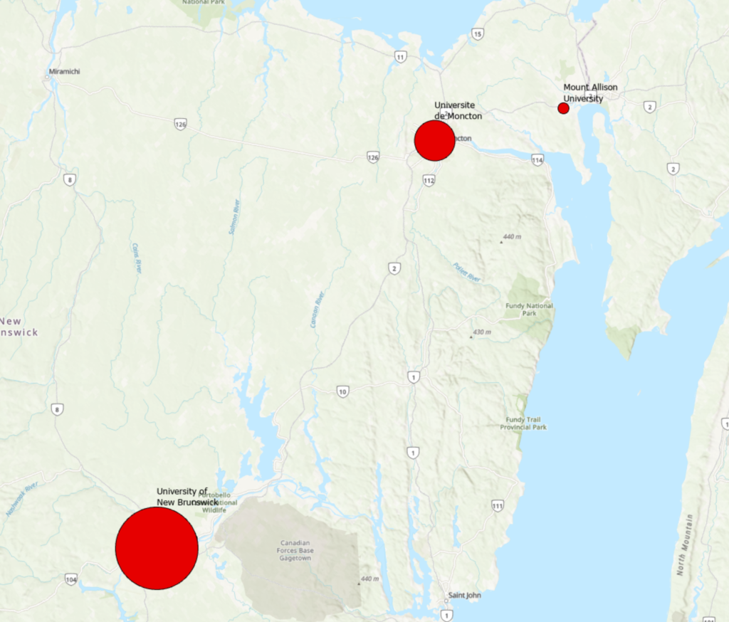
This layer contains the 3 universities in New Brunswick that have a post-graduate program as listed by Wikipedia (https://en.wikipedia.org/wiki/List_of_universities_in_Canada).
Once you add the layer, go to Feature Layer > Symbology > Proportional Symbols
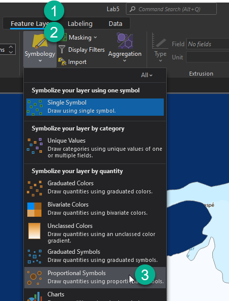
Next, set the field to Total [number of students], then pick a colour and shape you like by clicking the symbol beside template (circles are generally a good choice!)
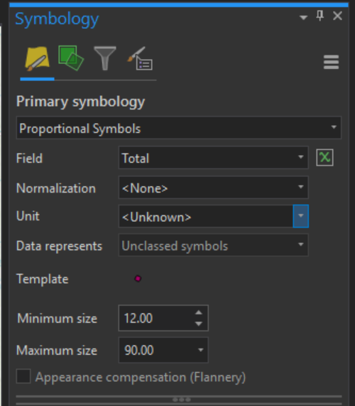
Note also that you can constrain the size of the symbols. If symbols are appearing too small, increase minimum size; if too large, reduce the maximum size. Consider Zoom to Layer since we’re only dealing with New Brunswick right now.
One more feature to note is the ability to select ‘Appearance compensation (Flannery).’ Appearance compensation is based on the fact that map readers will generally underestimate the size of proportional circles, so James Flannery’s algorithm compensates for this by slightly exaggerating the larger circles.
Add labels as we did in previous labs and you should have something as below.
ArcGIS Pro Graduated Symbols
Graduated Symbols work the same as proportional, except they are placed into classes instead of a gradient. You have already used Graduated Symbols on the roads in Smithers for Lab 4, so we will not be revisiting this today.
Charts
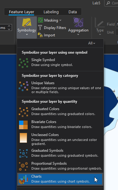
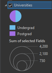
Continuing with the New Brunswick Universities, wouldn’t it be cool to know the proportion of graduate to undergraduate students? To do this, under symbology, choose charts:
Set Chart type to Pie Chart
Fields will be Undergrad, and Postgrad. You will also need to increase the size under Appearance to make the charts easier to read.
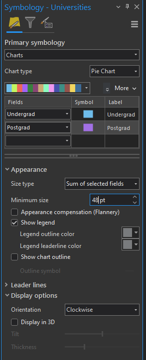
Finally, you may wish to set Display options to Clockwise so that the chart starts at the top:
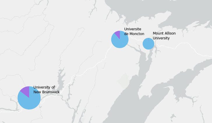
Discussion: What could be better in the legend below?
Using both Scale and Colour
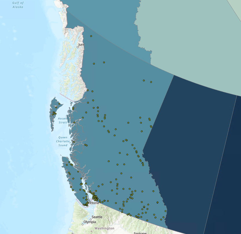
The keen among you may be wondering why there is a need to choose between Graduated Colours and Graduated Symbols. The answer is that you don’t need to choose. Before we continue, add the layer Populated Places from the portal. Zoom to your new layer.
Discussion: Would it be appropriate to place a north arrow on a map like this?
Consider the Following:
Would it be appropriate to place a north arrow on a map like this?
No.
Since this map is based on a conical projection for all of Canada, direction of “north” would vary so much across the map that a single north arrow could be misleading. However just for BC, it would align with the longitude lines – but not straight up, as the projection is centred on Manitoba.
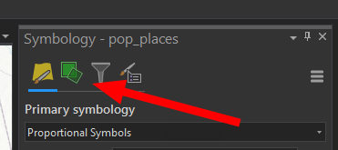
Start by styling pop_places based on one of the attributes above (graduated symbols or graduated colours), then click on the Vary Symbol by Attribute button in the Symbology pane.
If your primary symbol type is colour-based, you will be able to set a proportional size field. If your primary symbol is size-based, you will be able to set an unclassed colour ramp field. In all cases, select POP_2000 as your Field for both components of the symbology.
*Note that only the primary symbol type allows for graduated classes. Secondary fields will always be a continuous data range.
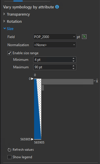
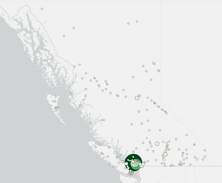
In this case there is only one attribute available, however this is a great way to quickly show multiple attributes.
4. Heat Maps
Sometimes you simply have too many points. An example of this would be the Lower Mainland (Vancouver BC) crash data from ICBC.
Turn off all layers except the base-map and add Lower_Mainland_Crashes_data.csv (from your copied Lab 5 folder) to your map as XY point data.
Once this data is added, zoom to layer, then notice how the points are so dense that you can’t really tell what is happening.
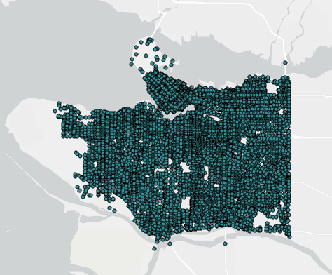
To fix this, select Heat Map from the symbology pane.
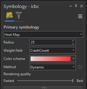
The settings in here are
- Radius – Determines how far to search for nearby points
- Weight Field – This should be set to crash count as each point can represent more than one crash
- Colour ramp – Same concept as we have seen in the lab so far
- Method – Choosing Dynamic recalculates the colour ramp based on the data visible on the screen (increased contrast as you zoom in)
- Refresh your map if changing your Method to Dynamic causes the whole thing to turn yellow
It appears that ArcGIS Pro has added transparency to the lower extremes of their heat map colour schemes by default now, so the following is no longer necessary. In case you are interested, though, consider the following supplemental reading:
Supplemental Information (not required):
Here is a trick on how to soften the edges of your color map:
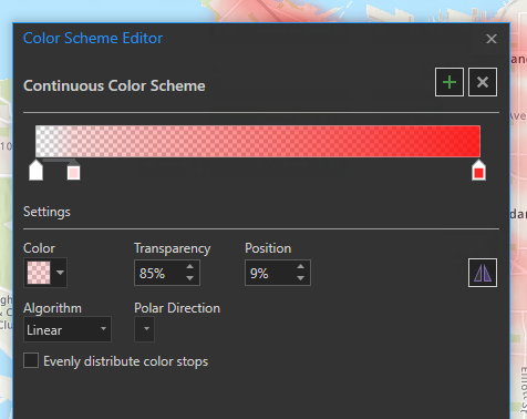
Inside ‘Format Colour Scheme’, this ramp has the rightmost colour chip as red with 15% transparency to help the labels be slightly more readable.
The left-most chip is 100% transparent, the chip just slightly to the right is at 85% transparent. This positioning causes the transparency to shift rapidly at low densities into fully transparent, ‘feathering’ the edge of the heat map.
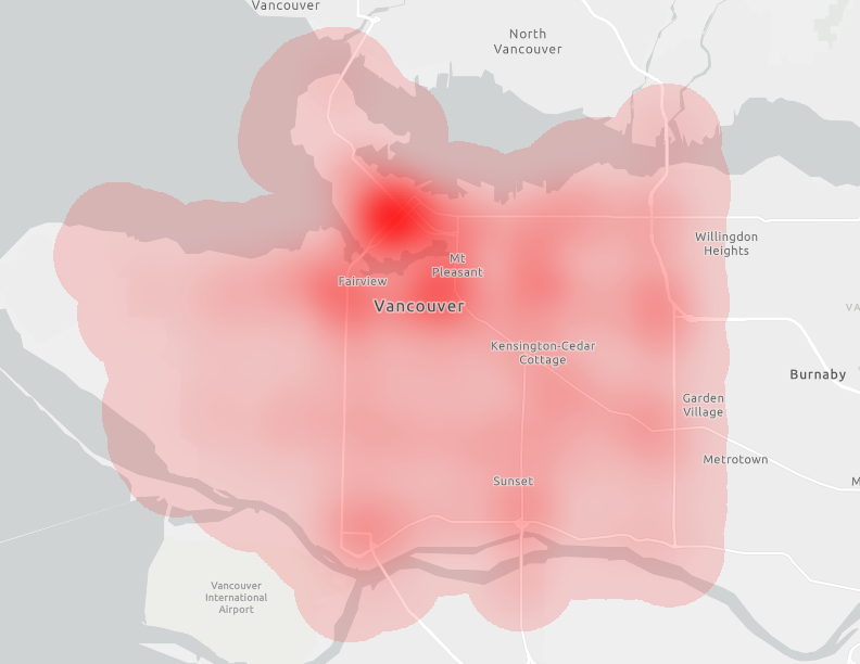
Before:
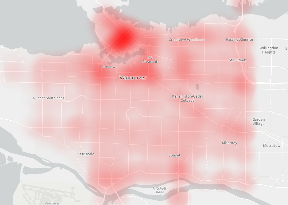
After:
Assignment 5
Due at the beginning of next week’s lab:
For your assignment this week, you will be producing two thematic maps. Pay particular attention to the overall aesthetic of your maps, and take care to make sure your heat map doesn’t look like a weather (precipitation) map.
Along with your maps, include 1-2 paragraphs about why you made the design decisions you have made.
- What meaning do your chosen colours and fonts convey?
- How do your chosen colours work together?
- What prompted your decisions on where to place elements such as legend and scale bar?
If you are looking for a way to find colours that work well together, consider using a colour wheel like this one: https://color.adobe.com/create/color-wheel
Marking Rubic:
A – To achieve an A on this assignment, see B below, with the addition that colours and fonts work well to convey the meaning of the map. A base map that matches your colours and labels has been chosen. Design is cohesive and conveys the ‘feeling’ of the map. Elaborate on your design choices in your paragraph provided with the maps. The paragraphs contain specific examples about choices you made in your own maps.
B – Map contains all required elements. It is laid out well, easy to read, free of formatting mistakes on labels and scale bars. The symbols that are used make logical sense, and are not overly messy.
C – Map contains all required elements listed in the assignment. Paragraphs contain generic definitions or reasoning behind map styling concepts and are not specific to your own map.
D – Maps are missing required elements, paragraphs are overly simplistic, generic, or not present at all.
F – Maps do not serve the intended purpose, key elements and paragraphs are missing.
Reminders:
- Export your maps as a pdf following naming conventions for the course:
<username>_geog205_lab5_<map>.pdf - All maps for this course must contain a Title, Your Name, and the Date you produced it
- All maps must include a scale bar and legend
- Make sure your map is visually pleasing. You have colours, fonts, borders, and multiple base maps at your disposal
- Explore the different base maps available to you (this is a rare occasion that we encourage you to use one), and experiment with turning different base map layers on and off. Some of the base maps are very simple in design with very few to no labels – this can be a benefit on thematic maps in building your overall look
- Try looking for base maps that include a “Reference Layer” – this layer contains the labels that you want to hide from your map. Ask your TA for more info about this
- Proofread your PDF before submitting to ensure that the formatting survived the export. If something isn’t looking the way you intended it to, reach out to your TA for help
1. Quantity Map of Canada Median Income 2015
Data: L:\GEOG205\lab05\Assignment\canada_median_income_2015.csv and the CA_ProvTer layer
Produce a map that uses a colour gradient to show Median Income in Canada by province.
- The province names in the median income CSV file will need to be corrected in the same way as you did for the Canada Energy layer
- IF IT WON’T LET YOU PASTE INTO THE ATTRIBUTE TABLE: Right click on the median income layer > Data > Export, save a copy somewhere on your K: drive (even if it was already on your K: drive) – this should solve the problem
- After correcting the province names, make sure to save your layer edits (the big save button in the Edit tab in the ribbon) before doing any joins
- Due to the complexity of the Canadian boundaries, ArcGIS Pro can take several minutes to draw the map once you enable labeling. If this is proving to be a challenge, one possible solution is to manually label each province by adding text the same way you do the title in the Layout panel. Using abbreviations can also help to keep the map clean.
2. Heat Map of Peru Seismic Events
Data: L:\GEOG205\lab05\Assignment\eventos_sismicos
Add this data to a new map by inserting a New Map (button next to inserting a New Layout in the Insert tab on the ribbon), or start a new project file.
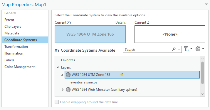
You can use the official projection in Peru (WGS 1984 UTM 18S). After adding eventos_sismicos.shp, right click on the Map and go to Properties/Coordinate systems. Select the projection from the shapefile.
Produce a heat map of seismic events in Peru. Map elements should include a legend showing the intensity scale. These are not absolute values, so labeling ‘high’ and ‘low’ would be appropriate. You have the option (not mandatory) to choose to use Magnitude as the weight (as we used count for crashes), however, you should be certain you understand what your map is displaying should you do this, and your title should reflect this choice (are you mapping frequency of events, or total activity?).