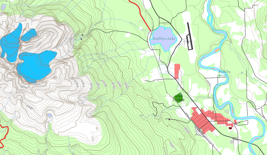
In today’s lab you will be working in ArcGIS Pro to produce a map of the Smithers area using source data provided.
Goals of Map Design
Several goals of map design can be identified. These include:
- Clarity
- Order
- Balance
- Visual Contrast
- Unity and Harmony
- Visual Hierarchy
1. Map Preparation
You will produce a map, designed for a letter sized page in landscape orientation (8.5 x 11″), following the cartographic principles taught in lectures.
In today’s lab we will be looking at examples of each type of symbolization. Your assignment will be to apply these steps to the remaining layers on your map.
You are strongly encouraged to work on this assignment during the lab section to allow your TA to answer any questions you may have.
Required Elements
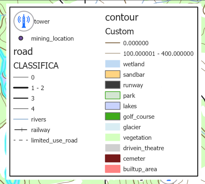
- Symbolize all feature layers
- Label features: contour lines, lakes, golf course and airport
- Locator map
- Title, scale bar
- Appropriate legend
- Your name and date
Make your map your own!
Create a new project in your geog205 folder on your K: drive.
As we are in a cartography class, we want to make all the elements of the map ourselves. Right click and remove the World Topographic Map and World Hill-shade layers before proceeding.
Add a folder connection to L:\GEOG205\lab04\smithers
Add the following layers: 2025roads, builtup_area, glacier, golf_course, lakes, park, railway, rivers, rivers_polygon, runway, smithers_contour, tower, trail, vegetation, wetland.
2. Symbolizing Features
Rearrange the drawing order so that all features are visible. A general rule of thumb is that layers are ordered from bottom to top as rasters, polygons, lines, then points; that said, there are always exceptions to the rule. As a cartographer you should always double check that design choices enhance the maps ability to communicate its purpose.
Symbolizing Polygon Features
Polygon feature classes can be symbolized with solid fills, outlines or patterned fills. They should not be overpowering (follow the concepts explained in the lecture for polygon coloring (no bright red parking lots).
Using vegetation as an example:
When Symbology first opens you will see the gallery tab. Here you can select from various pre-made styles. Give some of these a try, and then pick one of the green styles to use as a starting point.
Next we will change the symbol properties – there are two ways to do this:
Right click on the layer > Symbology > Click the colour swatch next to ‘Symbol’ in the Symbology Pane > Properties
Or double click the swatch in the Contents pane and choose the Properties menu.
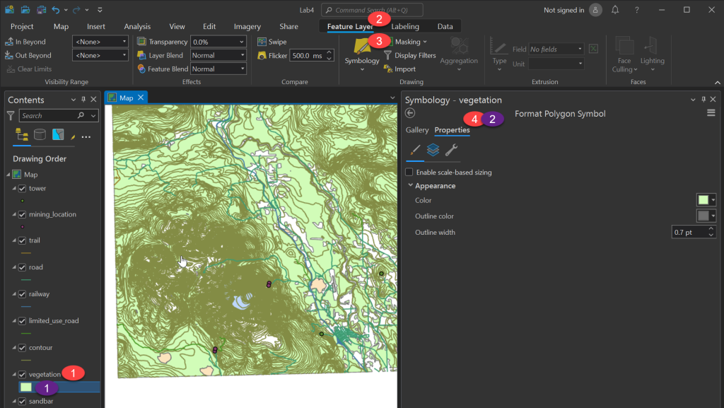
The Symbol Tab (the paintbrush icon in the Symbology Properties panel):
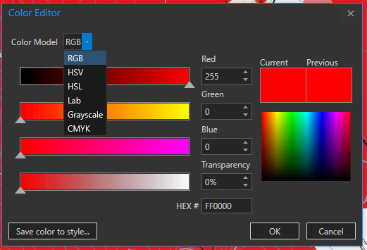
Using this tab allows us to set basic options such as the fill colour, outline colour, and outline width. Clicking on a colour swatch will bring up the ArcGIS Pro colour palette were you can pick one. If you want even more options, clicking colour properties will open the colour editor, where you can manually define the colour in a variety of colour spaces.
The Layers Tab (the stacked pages icon in the Symbology Properties panel):
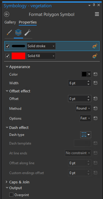
This panel contains a list of layers. In the screenshot above, this includes a stroke on top and a fill below. With each layer there is a drop down list to select the layers type: try a few to see what they look like. Specifically, check out the Hatched fill, and don’t forget to click Apply to see your new selections.
Below that is the properties for the selected layer, where you can set things such as colour, line width and dashes, hatched angles, etc.
Making Complex Symbols
Complex symbols, like the polygon below are symbols that are built of multiple components allowing for very fine control of how features are displayed.
As an example, for the golf course, we may want to use a symbol instead of a label.
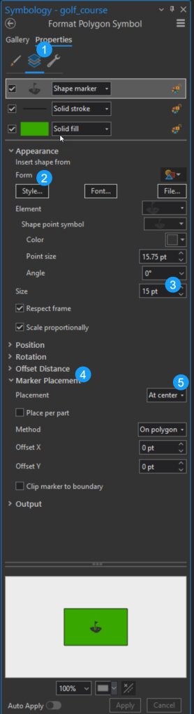
Open the symbology for the golf course layer. From here go to the Properties tab, then the Structure (wrench icon) sub tab, and add a symbol layer. From the drop down choose “Marker Symbol”
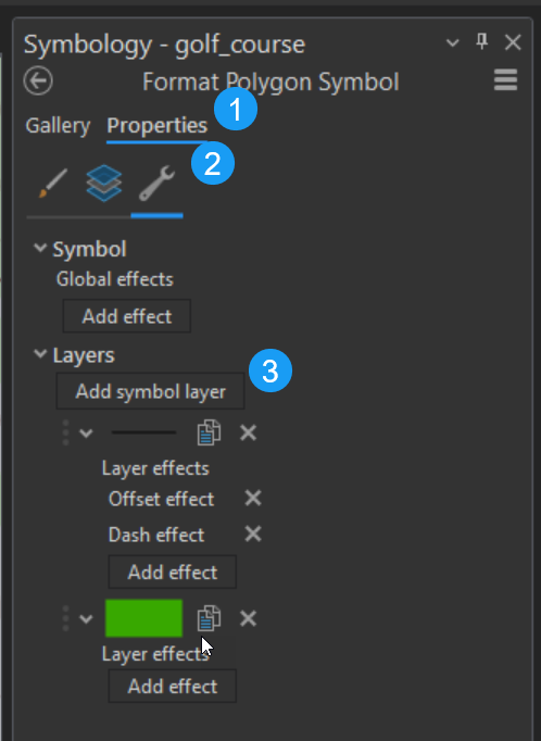
Next
- Open the layers subtab
- Under Appearance, pick a form from the Style menu (tip: you may want to search golf in the top search bar)
- Increase the size to 15pt
- Expand the Marker Placement menu
- Set placement to at center
Optional Advanced Material 1: another example for reference
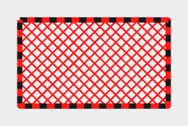
When using a dashed line; at any point on the line there will either be a dash of the specified colour, or a transparent section. How might we get a 2 toned dashed line?
Same with hatched style: all of the lines point the same direction. How might we produce this diamond pattern?
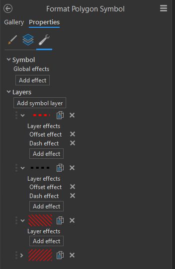
The structure tab (Wrench Icon) allows us to add extra layers to our symbols; and works much like the Contents view for map layers. You can add a symbol layer (primarily you will be adding stroke layers, and fill layers).
Once you add the type of layers you want and order them, you can return to the layers tab to set colour and other properties of your new layers.
Consider your map’s ability to communicate information. What does this symbol communicate? Is this a message you want to associate with vegetation?
You can make this symbol more appropriate by removing all but one of the fill layers, and setting it to a solid fill with a very light green colour.
Which of the two symbols we tried makes you more likely to want to go on a hike?
* End of optional material 1 *
Symbolizing Line Features
The example we will use for line features is the roads layer. This is a great opportunity to demonstrate the ability to modify symbol hierarchy. It is a very common feature on maps that major roadways will have a more prominent display versus side streets; this communicates to the reader to expect more traffic or faster speeds while traveling.
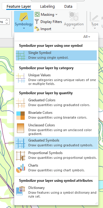
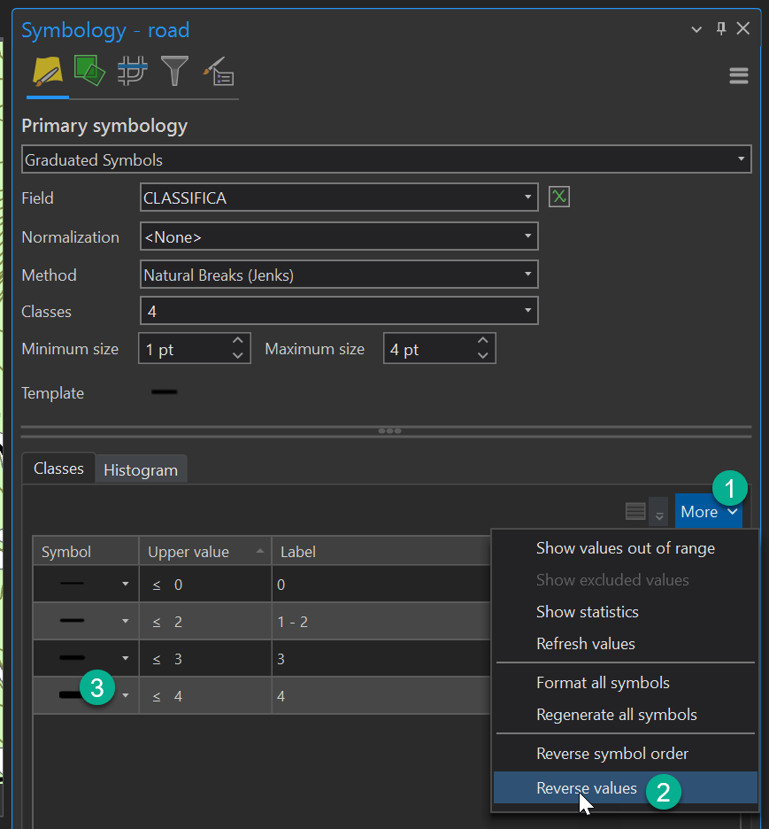
Select the roads layer in the table of contents. In the Feature Layer ribbon, open the Symbology drop down. You’ll find options for a variety of ways to draw symbols. So far, we’ve always used the ‘single symbol’ option. The other options in the list allow us to set the style based on the attribute table. In this case we will be changing the thickness of the roads based on their class, so we will use Graduated Symbols.
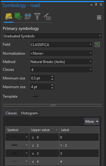
When using graduated symbols, the most important thing is to set the correct Field to define which symbols will be graduated. In this case, ‘CLASSIFICA’ contains the road classification, where one refers to major highways, all the way to four being smaller streets.
In data sets with many values, you may wish to normalize the data if they change at an exponential or logarithmic rate, but you don’t need to worry about that for today.
‘Method’ and ‘Classes’ are then used to define what the classes look like. In this case we can leave the ‘Method’ as Natural Breaks (Jenks). Here you may notice something interesting: the roads have classes 2, 3, and 4, but changing the ‘Classes’ value to anything greater than 3 will revert to 3. This is due to the data not containing any features with a classification other than those three categories (Class 2 road, Class 3 road, and Class 4 road).
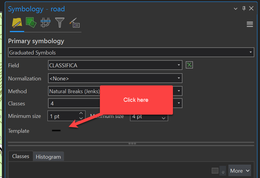
Next, go down to template, double click on the colour chip, and build the symbol you want. Once this is done, click the back button on the Symbology tab and we’ll set minimum and maximum sizes for the different classes of roads.
Take a moment to notice how your roads layer is displayed. When we introduced symbol hierarchy, we talked about how major roadways are often displayed more boldly than side streets. Is that how your roads layer looks now?
In the case of this layer, Class 2 should actually be the largest road, and Class 4 should be the smallest. Go to More and select Reverse values in the Classes tab so that Class 2 is the boldest. Once this is done, play around with the ‘Minimum size’ and ‘Maximum size’ values until you’re happy with how your roads layer looks.
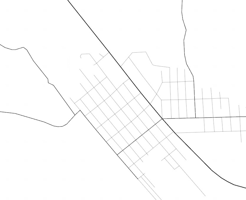
Your roads should now look a little something like this:
Symbolizing Point Features
To symbolize point features, we will look at the tower layer. When symbolizing points, we have many of the same options as we have for lines in terms of graduated colours and sizes. This is something we will explore in depth in the thematic map labs.
The big option that is different here is the shape gallery. You can use a variety of pre-made symbols to help add meaning to your points. Keep in mind that as the symbols get more complex, a map will seem more cluttered if they do not fit the style, especially if you have a large number of points. In this case we only have 1 – 2 radio towers in the map frame, so using a graphic as opposed to a simple shape could be appropriate.
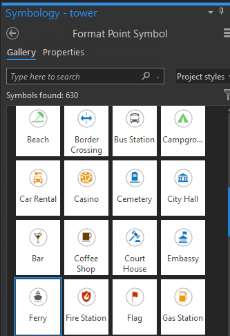
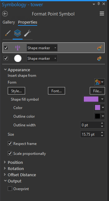
The properties work much the same as they do for lines, and again can be built in layers to make complex designs. As an example, the radio icon is made out of a tower marker and a circle marker stacked on top of one another, that can both have their individual properties changed in the layers panel. If there is an icon you want from the gallery, but it’s the wrong colour, most of them (but not the 3D graphics) can be edited by going to the properties tab.
Let’s take a few minutes to discuss what we have done so far:
- Modified polygon symbology (either as solid fill, or adding an icon to the polygon)
- Displayed a line layer using Graduated Symbols
- Modified separate layers of a point icon
Remember that these instructions are always here for you to refer back to should you need help finding the different symbology components. If you need inspiration for how to style your maps, have a look around the lab at the paper maps on the walls, or (cautiously) at maps online. What do those maps display well? What do they display poorly? Consider identifying something you don’t like on a map you have seen elsewhere, and try improving that feature on your own maps.
And finally, ask yourself:
- Is it possible to make your symbols too fancy?
- Have you saved your work recently?
3. Labeling Features
Basic Labels
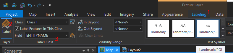
We briefly introduced labels in Lab 02 when we were displaying the names of TRIM and NTS map sheets, but today we’ll go into a bit more detail. Start by selecting your golf course layer again, then go into Labeling in the top ribbon, turn on Labels by clicking the big tag icon on the left-hand side, and then set the ‘Field’ to ‘ENTITYNAME’.
At this point, you will have a label on the golf course but it probably does not look good. We have two primary attributes to work with: style and position.
In the ‘Text Symbol’ section of the ribbon, you will see some pre-made styles that may make a good starting point (“Boundary,” “Landform/Physical Region,” “Landmark/POI,” etc.). Note that picking one of these will reset any manual changes you have made before selecting a preset. [Ctrl] + [z] can be useful in case of accidental clicks. There are also some options to pick the font, colour, and text size.
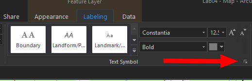
We want more options than these. To get to them, click the tiny expand icon in the lower right corner of the Text Symbol section.
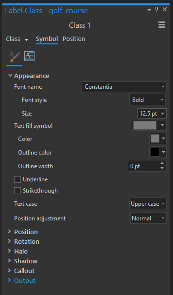
In the Label Class panel, we have a lot more control over how our text is displayed.
When doing styling, we have both a lot of conventions, but also artistic freedom. There is no single right way to label, but here are some tips to keep in mind:
Labels should:
- Be easy to read (appropriate font size, typically right side up, should have appropriate contrast against the background – halos may help with this)
- Provide some context as to what they are labeling (e.g., water is typically in blue italic fonts)
- Labels should not overcrowd the map
If you want to differentiate the text from the layers beneath it, outline colour is probably not the setting you are looking for. Instead, the halo effect is especially good for bringing text out from the background. In the Text Symbol ‘Label Class’ panel (like a properties or symbology panel for text), expand the Halo section, and set it to white with a size of 0.5pt. Notice how the golf course label changes.
Another section that you may find helpful is Callouts. These allow you to place your labels in frames that point to the feature, which can be useful if the label would block important sections of the map. Note that when using Callouts, the label position should not be directly on top of the feature. You could set this by using a fixed position by adjusting the X and Y offset in the Position section of the text settings, or using the positioning rules that we’ll talk about next.
If you really want to know more about using Callouts in ArcGIS Pro, Esri has a ton of excellent How-To pages online. This actually applies to anything ArcGIS: if you’re curious about how to do something, by all means search it online and explore the available tutorials.
Label Placement
Often when labeling you have requirements about where the labels are placed. For example, labels on a parcel of land should be contained within the boundaries of the parcel. This is where the Label Placement section in the top ribbon comes in. There are an assortment of pre-defined placement options to choose from depending on what geometry type (point, line, or polygon) you are dealing with, and in most cases these are all you should need.
If you are having trouble with your labels, you can press the expand button (the tiny one in the corner, like we did for Text Symbol) and the Positioning pane will open on the right, giving you options for how the labels are sized, placed, how they avoid overlap, how or if they automatically abbreviate, how often labels should repeat on line features, etc.
There are too many tools to go over in detail. We recommend you pick a predefined style that is close, determine which properties you are not happy with, and look for a setting to adjust that (again, Esri’s How-To pages can be invaluable here).
Contour Labeling
There are a few guidelines that are specific to labeling contour lines:
- Label placement should be centered over contour lines, not above or below them
- Expanding the ‘Label Placement’ box (the tiny arrow button in the corner of that section of the ribbon), will allow you to choose whether your labels are ‘Centered curved’ or ‘Centered Straight’ on the line
- Contour line labels should have a halo to help differentiate them from the line they are placed on (do this in the Text Symbol settings)
Selective Labeling
Selective labeling is another tool that is good to know, but not strictly needed for your homework. We’ll use it today to label some, but not all, of our contour lines (i.e., the index lines) using the ‘clause mode.’
The limitation with this method is that it relies upon someone having already identified the index contours. If we want to have more choice, we can compute the index ourselves, though that is beyond the scope of this course.
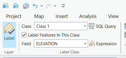
Select the Contours layer, then go to the Labeling tab in the ribbon. Toggle labeling on, then select the arrow drop-down at the end of where it says ‘Class 1.’ Select ‘Create Label Class…’ and leave the class name as default. For Class 2, deselect the ‘Label Features In This Class’ button. Switch back to Class 1 using the drop-down.
For Class 1, we’re going to create an SQL query. Click the SQL Query button, then create a Clause (a condition or a rule) that ArcGIS Pro will use to label the contours layer. Select ‘INDEX’ as the field, ‘is equal to,’ and ‘YES’ as the value.
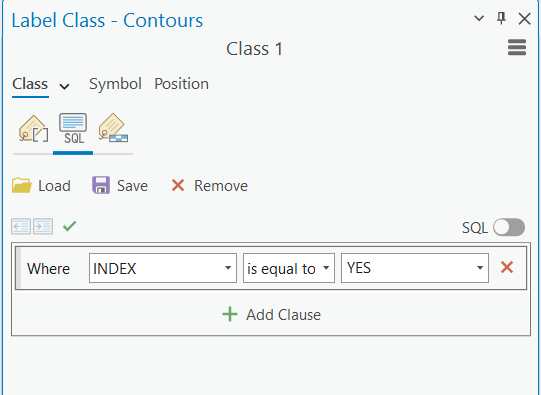
Have a look at the attribute table of the Contours layer to see why we did this: which Elevation values equal Yes in the Index field?
Now that we did the labels, you may also want to make the index lines thicker (but this is optional for your assignment). You can do this using Feature Layer > Symbology > ‘Unique Values’ and setting ‘Field 1’ to the Index field we just used for selective labeling. This will allow you to modify both symbols independently, however this will also mean that your Legend will include two lines for contours: one for your Index lines, and one for the intermediate contour lines, and they cannot be merged. A good recommended setting would be to use the same earth-tone color for both lines (search ‘contour’ in the symbology Gallery for a starting point), then set the value Index symbol to 1pt width, and Intermediate to 0.25pt width.
4. Create a Locator Map
Have you saved your project lately?
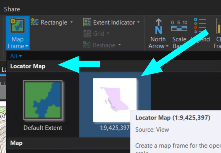
At this point in map creation, your main map should be somewhat complete, and it is time to start adding some external elements. Go to the insert ribbon and add a new layout, make it a landscape letter-size layout, and set your scale to 1:60,000.
Next on insert go to “New Map”
Right click in the Drawing Order where it says Map1 and go into properties:
Under General: Change the name to Locator Map
Under Coordinate Systems: Change to NAD 1983 CSRS BC Environment Albers
Remove the default layers (World Topographic Map and World Hillshade). In Catalog, go into the Portal and find the layer “BC Boundary” add this to the map. The only thing on this map should be a polygon of BC.
Select your ‘bcbound’ layer and style it in a way that you like.
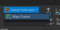
Go back to your Layout tab, and Insert a Map Frame again, this time making sure to choose the Locator Map. Add a small map somewhere on your layout where it does not cover important features.
Still in the Layout tab, with your Locator Map selected, click Extent Indicator, and select your first map frame (probably labeled ‘Map Frame’).
This extent indicator may only show up as a single pixel at first. That’s okay! We’re going to fix that.
To make the symbol visible, go to Extent of Map Frame Properties (right click on the layer > properties). Set the Collapse to Point option to 10 pt.
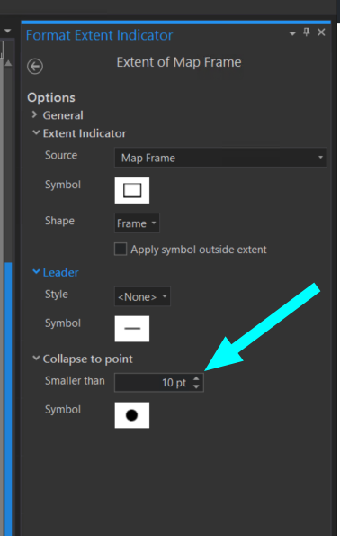
This setting will cause the polygon to be rendered as a point.
Adjust the symbol to something you like and is a good size for identification by clicking on the symbol in the Element properties.
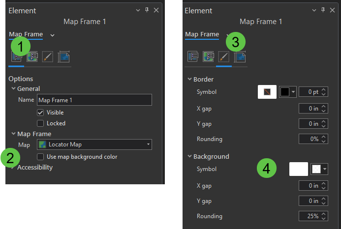
Finally if the transparent background is hard to read, right click on the Map Frame 1 (see in the map view pane that your locator map is selected by the presence of adjustment boxes surrounding that map frame) in the Drawing Order and open its Properties > this opens the Element pane on the right. In the left-most icon (Options), make sure under Map Frame > ‘Use map background color’ is deselected, then go to the ‘Display’ (paintbrush) tab, then adjust the background symbolization. This is a great place to try out some transparency (click the colour drop-down menu, then select Color Properties… and adjust the transparency slider at the bottom of the Color Editor window).
5. Adding a Legend to the Map
So that you don’t have to do any of this again if anything goes wrong… save your project.
To add your legend, select the Legend tool in the Insert ribbon at the top of the screen. Draw a box where you would like to place it. Does your legend include only “bcbound”? This is because you added the legend based on your locator map, and not on your main map. This is a common mistake that happens when adding a scale bar, too. Delete the legend, then make sure that ‘Map Frame’ (and not ‘Map Frame 1’) is selected in your Drawing Order, then try adding a legend again.
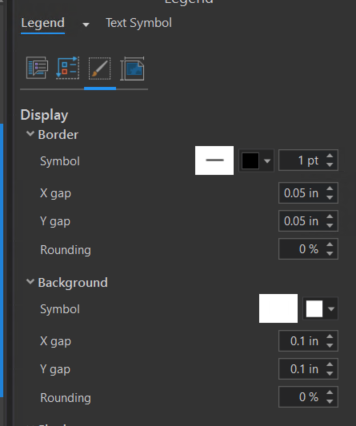
Just as on the locator map, go into the legend’s display properties and set a background so you can clearly see the symbols. Additionally, you will notice that your symbols are directly touching the edges; to make it more readable, consider adding some X and Y gaps in the Background and/or Border section.
Now we have a legend, but it still doesn’t look very good – we need to modify the symbols and labels. In the Element pane, select the Options tab, then in Legend Items, click ‘Show properties…’:
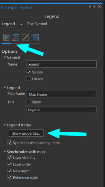
At the top of your Drawing Order on the left, you will see a section for Legend with all of the items listed. Let’s start by turning off some unnecessary labels.
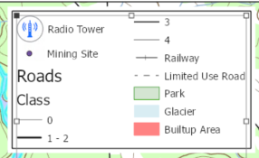
Turn off: runway and golf_course as these should be labeled on the map and therefore don’t need to be listed a second time in the Legend.
Turn off: rivers, lakes and vegetation, as these should be intuitive by looking at the map and offer unnecessary clutter. (Note also that ‘vegetation’ in Canada generally means ‘Forest’ (trees)).
Go back to Map View (for your original Map, not the Locator Map), where we can start fixing labels.
Do this by renaming the layers in your drawing order. Fix capitalization, replace underscores with spaces, and extend any truncated names (tower should be Radio Tower). Correct Builtup (not a word) to Built-up. To make the changes, just double click on the name you want to update (make sure you are in the Map View and not the Layout View). Making these changes in Map View and not Layout View changes the layer, and not the legend item. Bounce back and forth between Map and Layout views to see the changes you’re making reflected in the Legend.
In the Legend Properties, deselect Synchronize with map: Layer Order
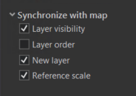
This will allow you to re-arrange the order of the legend, without needing to move layers drawing order on the map.
For the Contours layer, if you have Index and Interval lines displayed differently, they may appear in your Legend as ‘YES’ and ‘NO.’ To make this more logical, either go to the Contour Symbology pane and change them to Index and Interval on the ‘Map’ side of things, or, in the ‘Layout’ side of things, in your Legend list in the drawing order, right click on Contour, select ‘Properties,’ then in Legend Item as in the image below, deselect ‘Label (or layer name).’
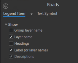
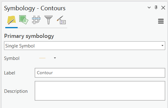
Alternatively, if you have styled your contours layer as Single Symbol in Symbology (independent of your labeling), your Contour layer will appear as a single item in your legend, but still needs some adjustment: (1) turn OFF ‘Layer name,’ turn ON ‘Label (or layer name),’ then go to the ‘Single Symbol’ Symbology panel and set your Label to Contour.
Finally, open the properties of the Roads Legend item and turn off Headings…
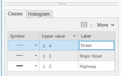
…then go back to the Roads symbology settings (select Roads, then Feature Layer > Symbology) and replace the numbers in the ‘Label’ column with more meaningful labels (see below for examples). Also in the legend, ensure that the Roads don’t occur in both columns. One way to do this is in the Layout view, go to Legend Properties, go to Legend Arrangement Options in the Element pane, and change the Fitting Strategy to Manual Columns. This gives you two columns in the Drawing Order, and you can click and drag layers as you see fit, to put them in an order that makes sense to you. In the Spacing section, you can also modify the value for Items, which will spread all of your legend items apart while maintaining the default distance between your different categories of the Roads layer.
Alternatively, right click on Roads, go to Properties, and under Arrangement > select ‘Keep in single column’.
As one last check, make sure that there are no entries in your Legend that do not appear on your map. If you’re not sure whether something is visible in your set extent or not, go ahead and make that particular feature over-the-top obvious (for example, very bold and some blindingly bright colour that you would likely never use on an actual finished map). Can you see it in your map layout? If not, remove the layer. If you can see it, set it back to a more appropriate style. Try this with the Trails layer.
You should now have a better looking legend.
6. Adding a Scale Bar to the Map
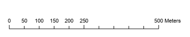
We already covered scale bars in the first lab, but if you would like a refresher, the scale bar is found in the insert ribbon. You can use the drop down menu to select the style you would like to use, and then draw a box on the map where you would like it to appear. Make sure the distance seems correct – does your scale bar suggest that the Town of Smithers (with a population of approximately 5000 people) is thousands of kilometres long? It is actually more like 5 kilometres long. If your scale bar doesn’t look right, check to see which Map Frame in your Drawing Order was active when you created it.
When you add your scale bar, it will most likely show up with some messy looking divisions. For most people, 0.07 KM is not a meaningful unit of distance.
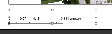
Using the Element panel on the right, make sure the units are suitable – in this case, Kilometres would be a good choice (remember that Label Text beneath Map Units allows you to control the spelling), and change the width of the scale bar to make it 5 km long. This is starting to be more useful but it may produce some awkward subdivisions. Under scale bar properties:
Change the number of Divisions and Subdivisions so that the divisions represent a clean looking distance. In this case, I went with 2 divisions with 5 subdivisions, but you may find other combinations that work well. Additionally, you may notice that the labels still seem a bit off. you can change how the labels appear under the numbers section, using the Frequency Setting, as an example setting to ‘Divisions and first subdivisions’ produces the following result.
7. Adding a North Arrow to the Map
Before adding a North Arrow to a map you should ask yourself if you need a north arrow.
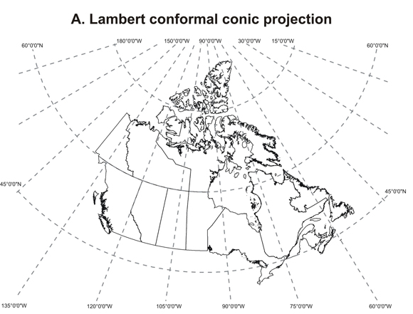
As an example, if your map is north-up, it is not necessary to use a north arrow, but you may still wish to include a small arrow for style or clarification. If your map is using a conic projection, a north arrow should never be used, as north is not always the same direction on the map!
Conversely, if your map does not have north up, an arrow should be provided to alert readers to this.
Adding the north arrow is as simple as on the Insert ribbon, going to the drop down on north arrow, selecting the style you want, and drawing a box where you want it to appear.
Also notice towards the bottom of the map there are options that point to magnetic north, and the Topographic styles that show both True North, and Magnetic North. These may be appropriate choices where the map will be used with a compass for navigation, but otherwise magnetic north should be avoided as it will not be intuitive to most people.
Lab Assignment #4, Due before next week’s lab
The lab assignment is to produce a finished map (8.5 x 11″) with free use of colour.
Evaluation for the assignment:
This assignment is worth 5% of the overall class grade.
Your grade will be based upon having all required elements, and that they are stylized and have appropriate layout of ancillary information.
Ensure that your symbolization follows cartographic rules, and sufficient contrast enables the distinction of all symbols.
Add the following layers:
- built-up_area
- smithers_contour
- glacier (label on map)
- golf_course (label with symbol – text label not required)
- park
- lakes (label on map)
- railway
- rivers
- rivers polygon (label on map)
- roads
- runway (label on map)
- tower
- vegetation (label as Forest in your legend)
- wetland
Submit your files to Moodle as <username>_GEOG205_Lab4.pdf
Before you upload to Moodle, check your map for errors, ensure all layers are present, the correct paper size was used, and as always consider whether this map communicates its purpose.
Tips for success:
Attention to detail is important in this course. Make sure to pay particular attention to any instructions that are at a bullet point or bold, as these items are directly within the marking rubric. As we proceed through the course, we will also be looking to see that you are applying good mapping principals, which can be evaluated by asking yourself a series of questions such as:
- What message do I intend for this map to convey, and does it convey this message well
- Are there any elements that could be removed to reduce clutter?
- Are there any layers missing? / Do they need to be in the Legend?
- Are the layers in an appropriate order so that they do not cover important information?
- Are the labels on the map readable? Is there crowding or are fonts too small to read?
- Are the colours on the map visually appealing? Is there appropriate contrast?
- Do the colours on the map follow conventions? ie. Water is blue, vegetation / parks green, built up areas either grey or red.
- If there is hierarchy on the map, is it intuitive? Your map should draw readers towards the purpose of the map.
- In general, more major items should either be bigger or use stronger colours compared to minor features.
- Is the scale appropriate? Are locator maps needed to identify the location?
- Does the projection used make sense? (Tip: Try to define the attribute of the projection that makes it the best choice, it is good practice to always question defaults)
- Do you need to indicate north? Is north the same direction everywhere on the map?
- Is ancillary data present? Title, Date, Author, data attributions (i.e., what organization produced the data that you used)?
- Does the final product match the customer (TA) specifications? Page size, orientation and file format.
**Optional** – Preparing ArcGIS Pro for print export
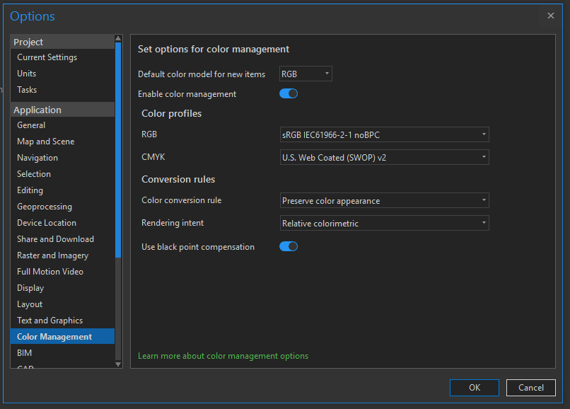
By default, ArcGIS Pro is set up for computer display. However, if we want to produce print maps, and have them look on paper as they do on screen, we should enable colour profiles.
The reason we use different colour profiles is that colour is handed very differently on a computer screen as opposed to printing. A computer screen uses the primary colours of light (Red, Green, Blue); on the other hand a printer uses the primary colours of pigment (Cyan, Magenta, Yellow) and additionally blacK from which we get CMYK.
Click Project >>> Options, then enable colour profiles as seen below. (We will leave the default as RGB as that is what we will be using for the remainder of the course).
Now right click on Map, under the drawing order choose properties, and set the colour management for this specific map.
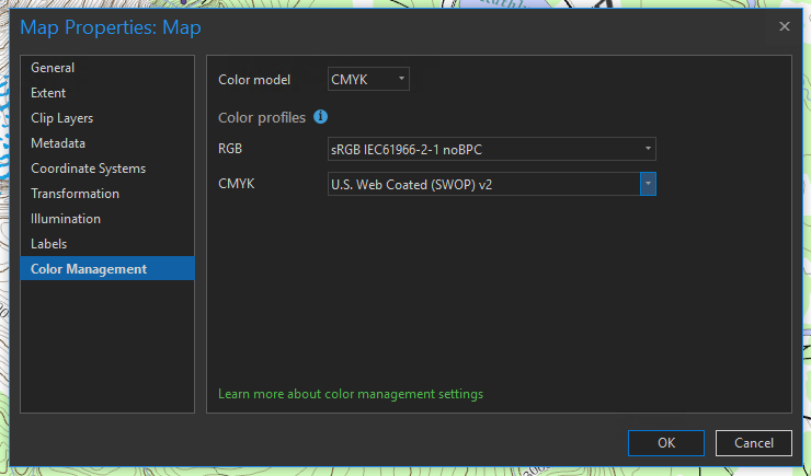
Pick CMYK, and leave the default colour profile, when working with a professional printing company they would provide you with the profiles that match their printers.
You will likely not notice a difference in your display, other than potentially blacks becoming less dark. Unless you own a colour calibrated monitor in which case you would notice a slight shift in some tones. Colour calibration works by using a colorometer to measure the colours sent to a monitor and what is actually displayed, and creates a look up table to help the computer display the desired colour; likewise this is done with the printer to account for differences in ink or the papers effect on colour. In most cases this may be minor, but if you have important projects the extra couple of steps may be worth it.
Below this image shows an example of a monitor pre-calibration (upper left triangle) and post-calibration. When you consider these effects could be combined with similar results from a printer you can start to see how noticeable the changes can be.